
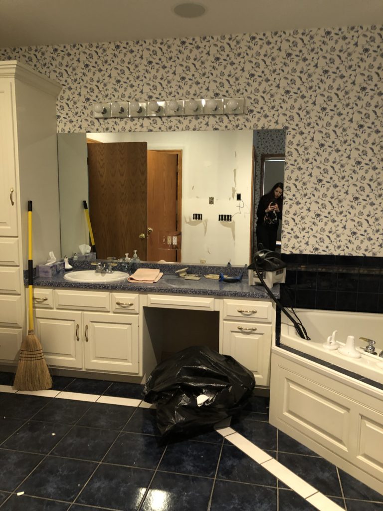
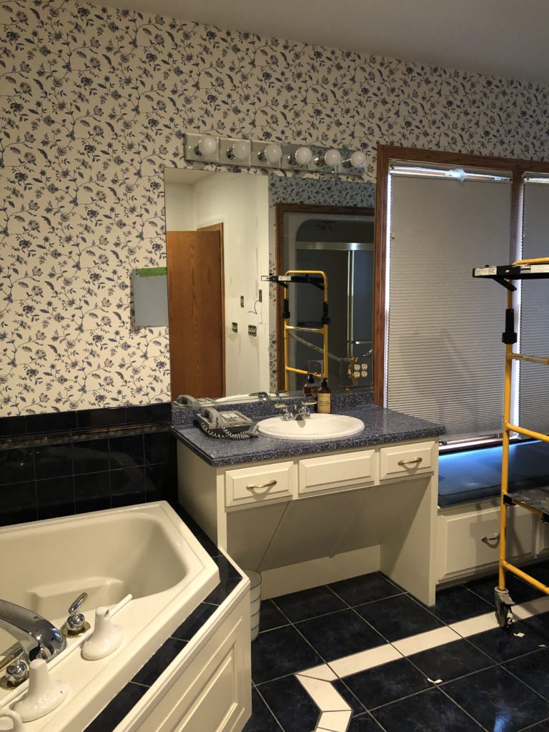
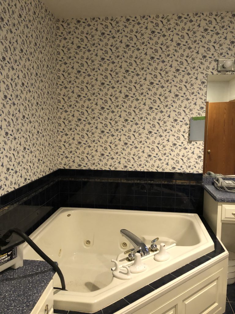
My clients purchased their dream home in a lovely golf course community with amazing views. They knew the home had a lot of potential, but the master bathroom’s design left a lot to be desired.
If you follow me at all, you know I love blue and white. But not so much THIS time. The layout in general was fine, but man, did this bathroom need a facelift.
My clients wanted a nature-inspired, spa-like space. The floral wallpaper, harsh dark tile floor, outdated lighting, and super odd shower setup just weren’t doing it for them.
Here’s the before:
Cabinetry
The cabinetry was in really great shape and a nice off-white color. The bathroom is circa early 1990’s and these are the original cabinets. The fact that we could keep these cabinets as-is is such a testament to classic design. If you stay classic and purchase quality wood cabinets, they will last.
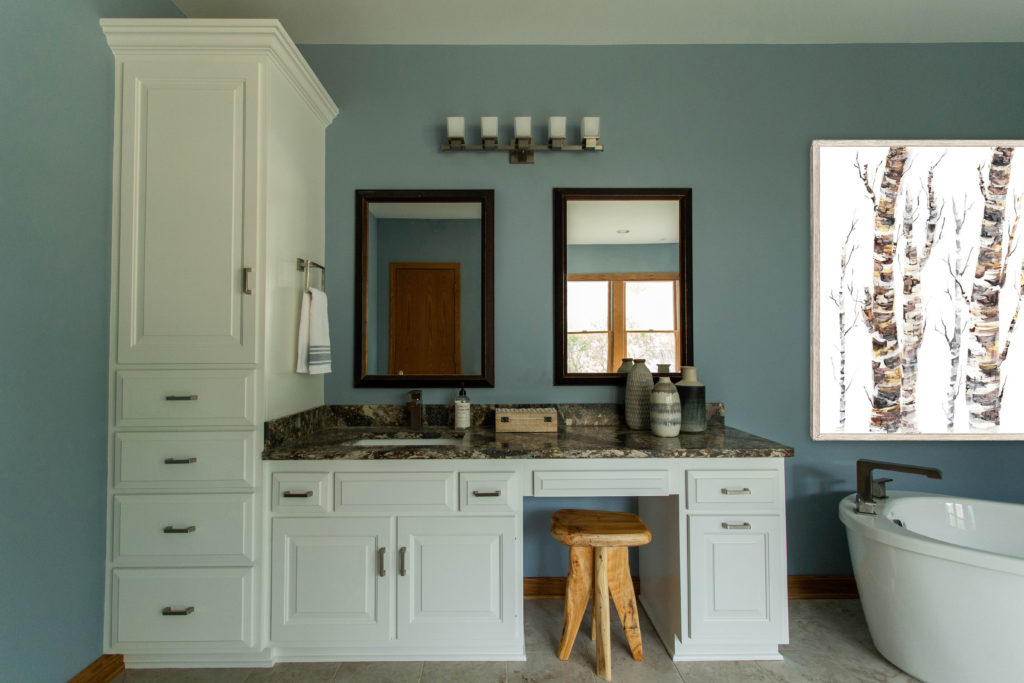
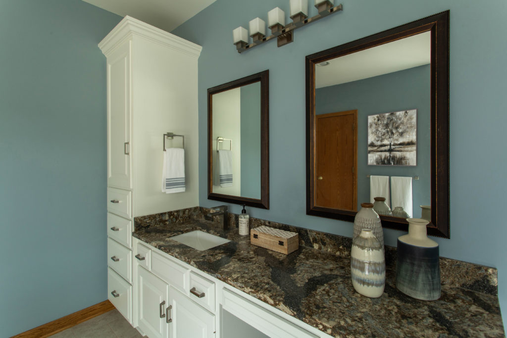
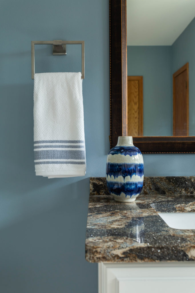
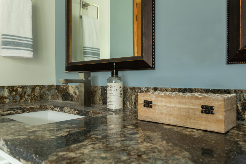
Quartz Counters
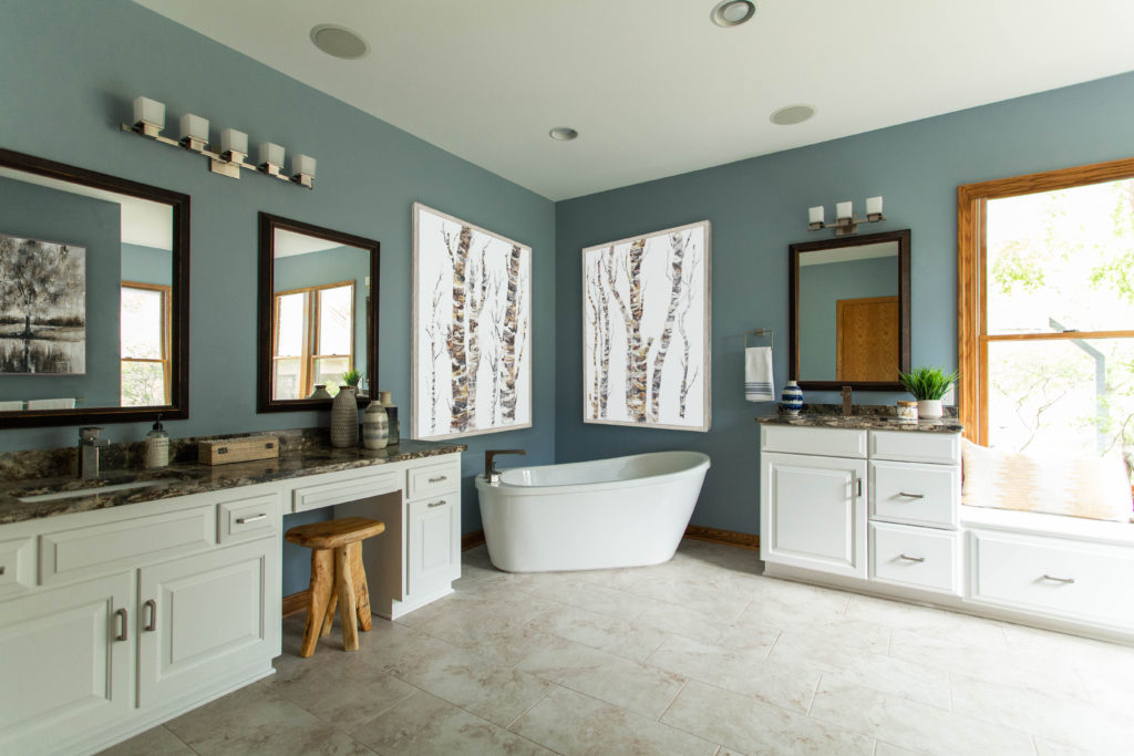
The stars of this bathroom are the beautiful Cambria countertops.
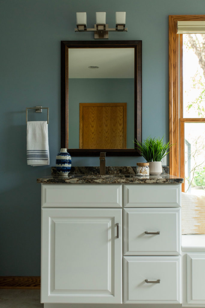
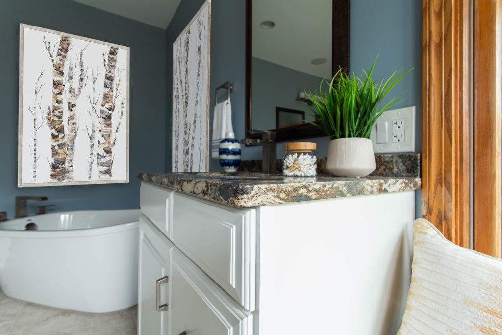
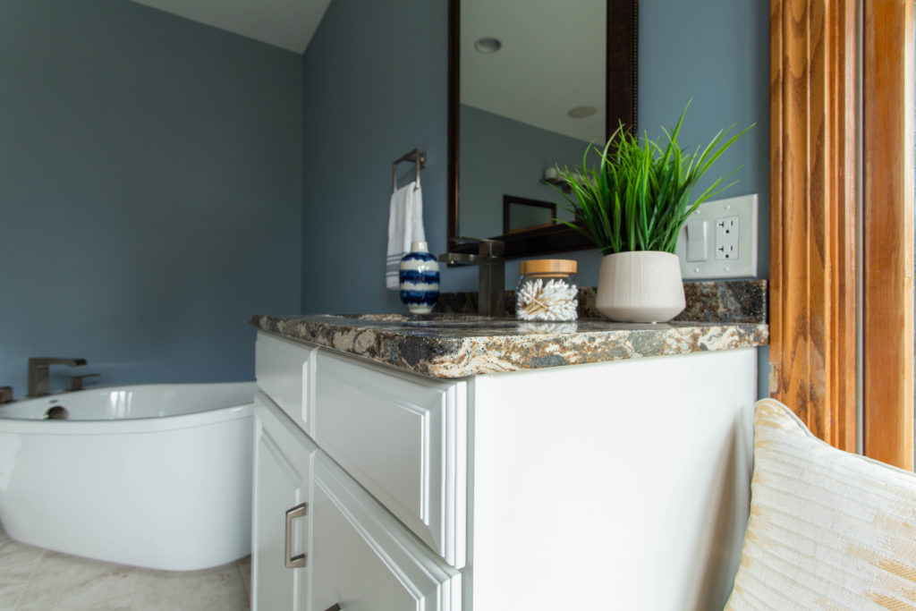
Mirrors
My clients really wanted to find some unique mirrors for the bathroom, so I recommended heading to a few local thrift stores, with minimum and maximum measurements in mind. They found these mirrors from a local historic hotel, and we couldn’t be more thrilled with how they look in this bathroom!
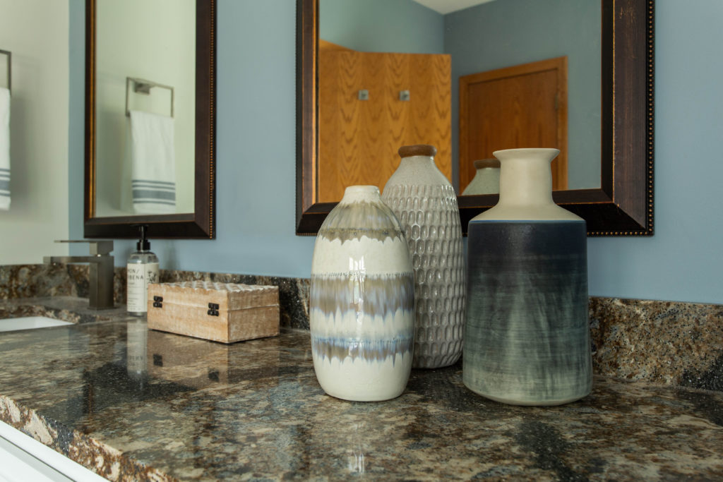
Check them out up close! They have a ton of beautiful, natural movement.
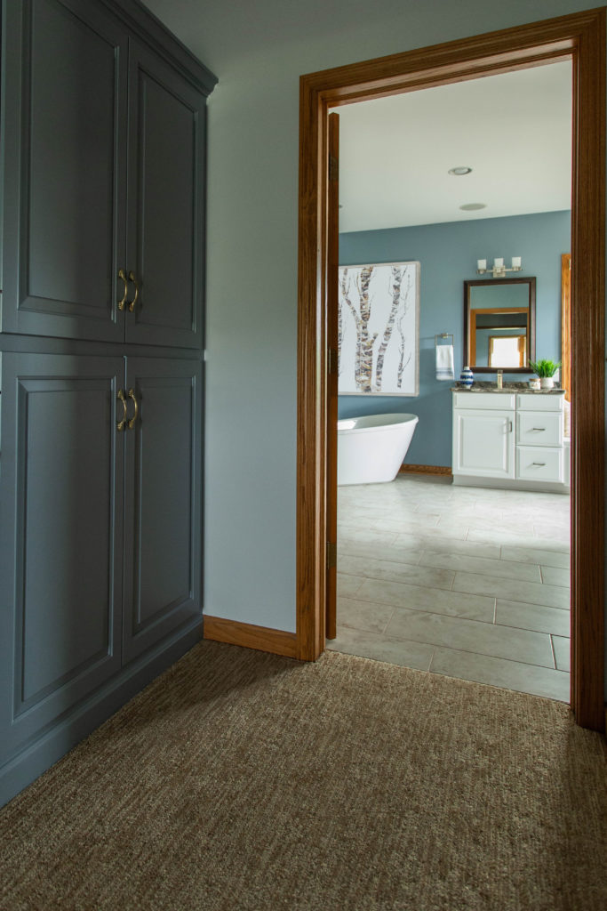
Dressing Room
The adjacent dressing room also got a makeover! Before, the room was REALLY TEAL. You all know I adore color, but this was not the right color for my client’s desired spa lodge feel.
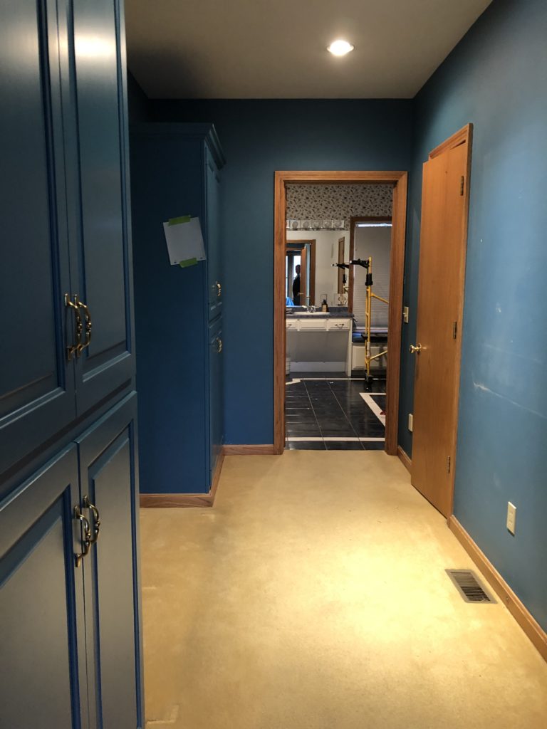
The cabinetry was painted to match the bathroom walls. The walls themselves we painted a lighter blue. We selected new carpet with natural texture and warm neutrals to coordinate with the warm oak trim.
New Vanity
The original bathroom had a wheelchair accessible vanity, which the current owners don’t need.
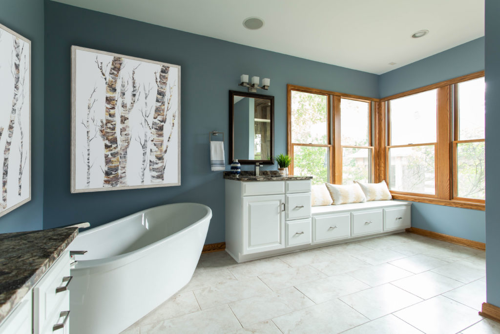
The new vanity adds more practical storage to the room.
Hardware
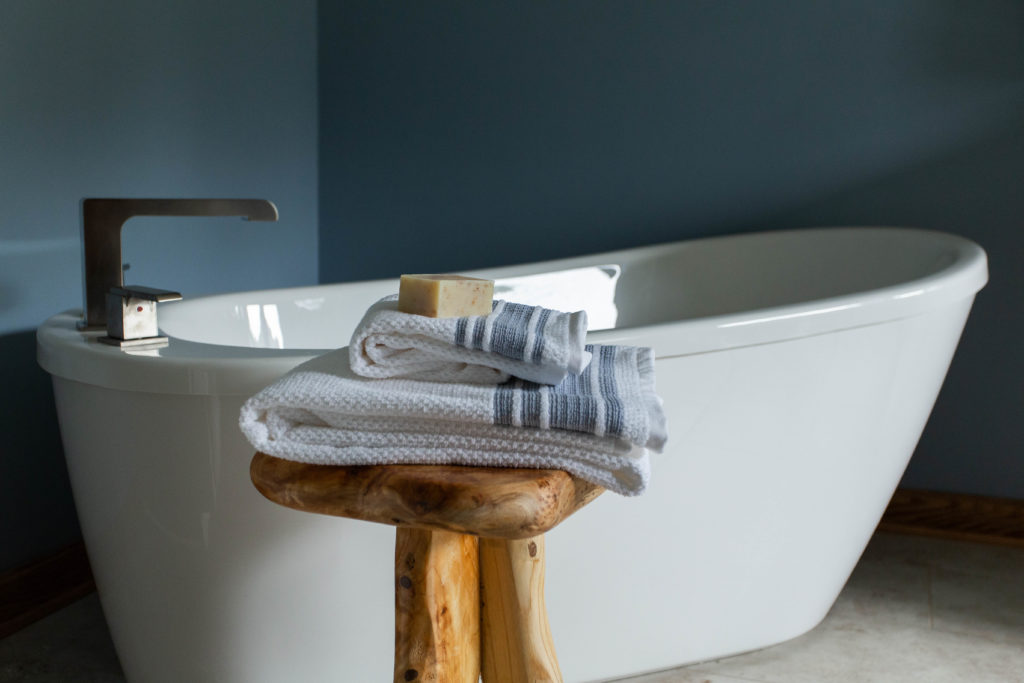
I selected new, more contemporary brushed nickel hardware and accessories to update the space. Isn’t that towel ring pretty?
Artwork
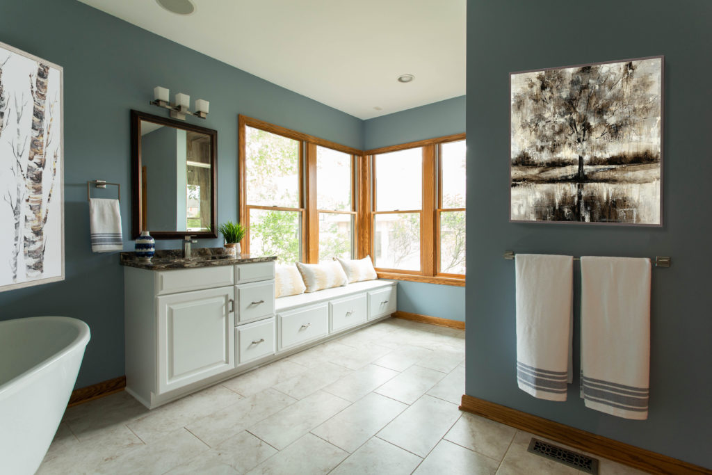
Large-scale artwork is necessary for such big walls! It’s much more impactful to put a couple large pieces in a room, versus tons of small ones (with some exceptions – a good gallery wall here or there is fun too).
See how plain the room looks without art? Art makes a huge difference!
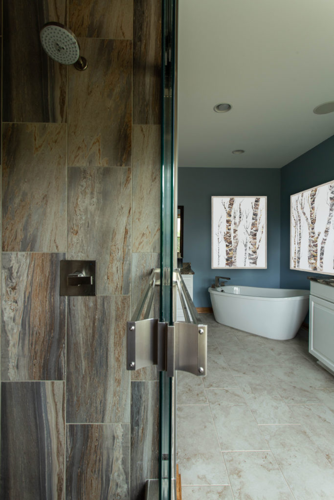
That Tub
Now, let’s chat about this tub monstrosity. I hate triangular tubs. They pretend like they’re for two people, with their two different “sides” for sitting. But honestly…where are your legs supposed to go? This whole tub was only 60″ wide – that’s 5 feet total. It’s not deep enough to sit upright and be warm, like in a regular hot tub, so you’re sprawling out…it’s just not practical and frankly a waste of space.
Solution? A regular freestanding tub! This is a BIG tub (it’s hard to tell since the bathroom is soooo huuuuge, so you’ll just have to take my word for it.)
Here’s a close-up for your viewing pleasure. I selected a streamlined tub faucet to coordinate with the rest of the room’s hardware.
Here’s a look at the bathroom from the other side of the room. We kept the windows open to take advantage of the beautiful green views outside.
Flooring
Let’s talk floors for a minute. The original tile was dark blue. Fine. I really thought we might be able to make it work, based on my client’s initial description. But then I get to the house and see the white racing stripe around the whole floor.

Sigh. When you’re working with a room with multiple angles and funny corners, please don’t add unnecessary fancy tilework. Do you really want the tile to be the star of the show?
Here’s the new floor. It’s a 12″ x 24″ tile, which is the perfect scale for this large space.
It’s also a nice, pleasing warm neutral that compliments the warm oak trim and warmer countertops. It’s a rare thing that your floors should be your focal point.
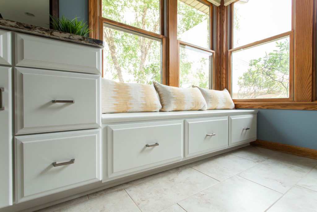
Window Seat
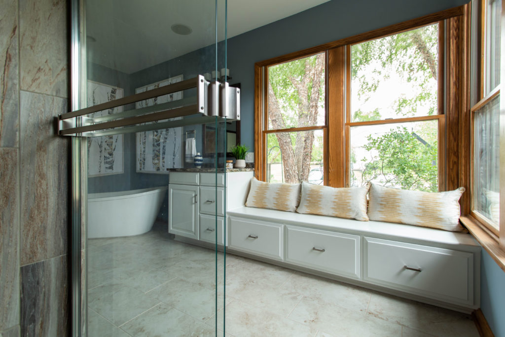
I don’t usually find a window seat in bathroom, but this one was just begging for some comfy pillows!
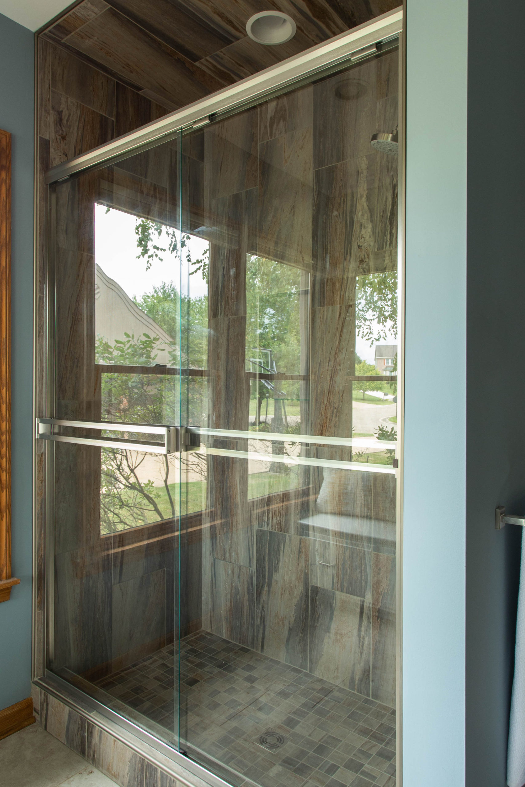
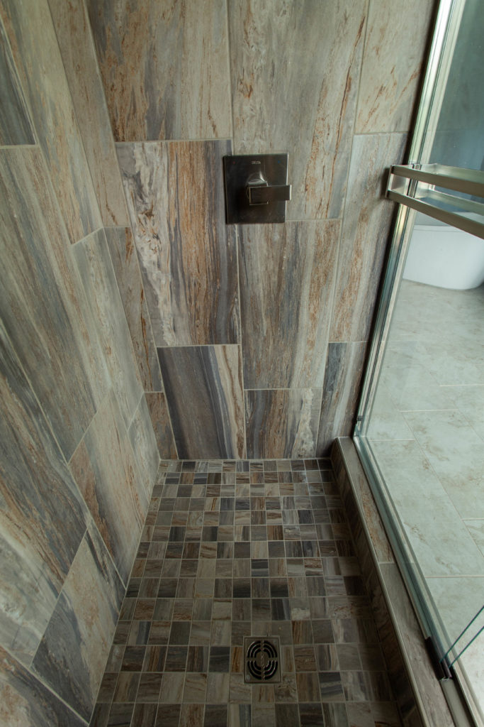
Shower
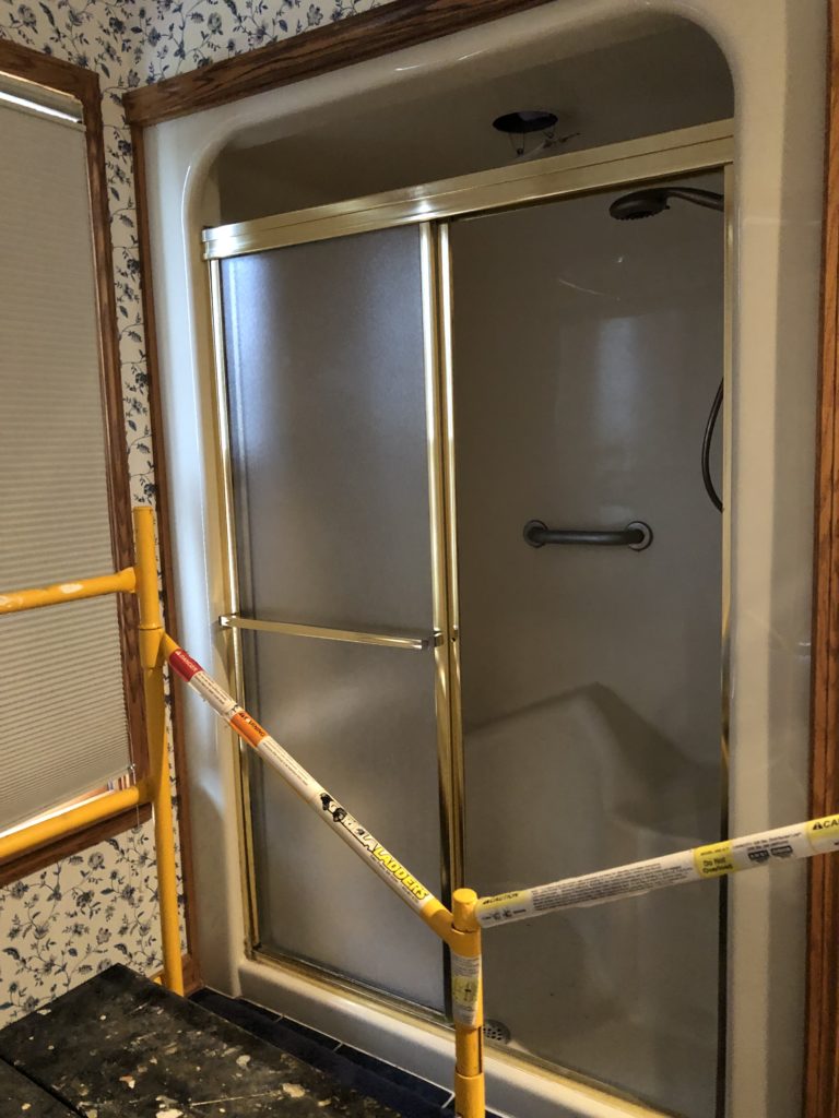
Onto the shower: The original shower was a solid insert with an inexplicably low ceiling and two benches. Despite having a large footprint, the actual usable space in the shower was teensie!
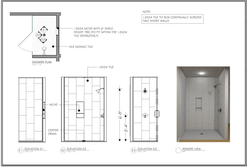
We ripped out the unit and extended the ceiling to the shower. For that rustic spa feel, I selected large-scale wood-look tile and extended it onto the ceiling.
SO much better and more open!
I selected this particular tile for two reasons.
- My clients wanted an easy-to-maintain shower. The less grout lines, the easier to clean. The larger the tile, the less grout lines there are.
- The woodsy spa feel my clients wanted to achieve just SCREAMED for a wood-like tile somewhere in the space!
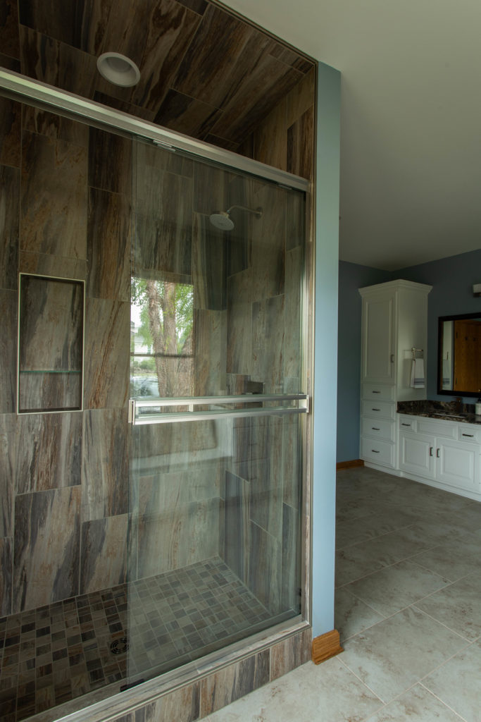
The warm tones in the tile coordinate really well with the tones in the quartz counters.
See what I mean?
That’s That!
I hope you enjoyed seeing this transformation as much as I enjoyed transforming the space! Contact me if your bathroom needs an upgrade. I’m here to help!

Emma Clemantine
| 30 March 2025What an amazing master bathroom transformation, The before-and-after contrast is truly impressive. It would be great to hear more about the design choices and any unexpected challenges during the renovation.