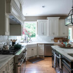
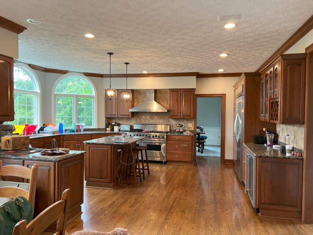
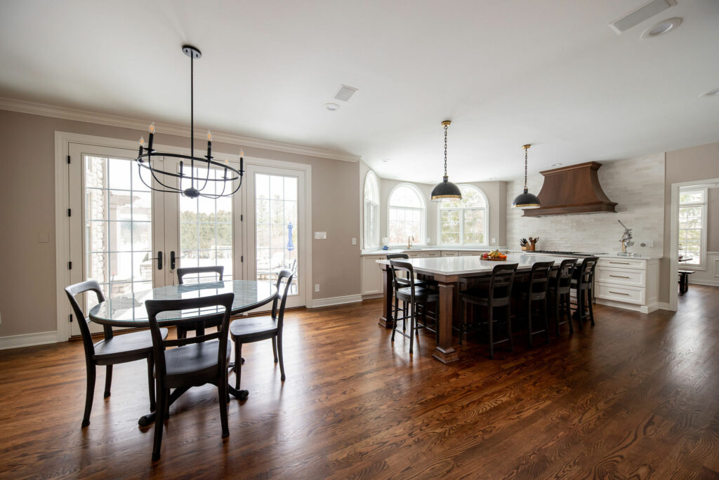
This Hudson kitchen had plenty of space, but the overall layout and design choices just weren’t working for our clients. The island was super tiny, the odd peninsula cut the kitchen in half, and soffits above the range hood weren’t working for anyone.
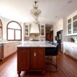
We redesigned the kitchen to include a huge island with space for six people to comfortably eat. We also removed the soffits and brought in a gorgeous wood hood for some much-needed contrast to the new white cabinetry. The space became so much brighter just by getting rid of all that dark wood!
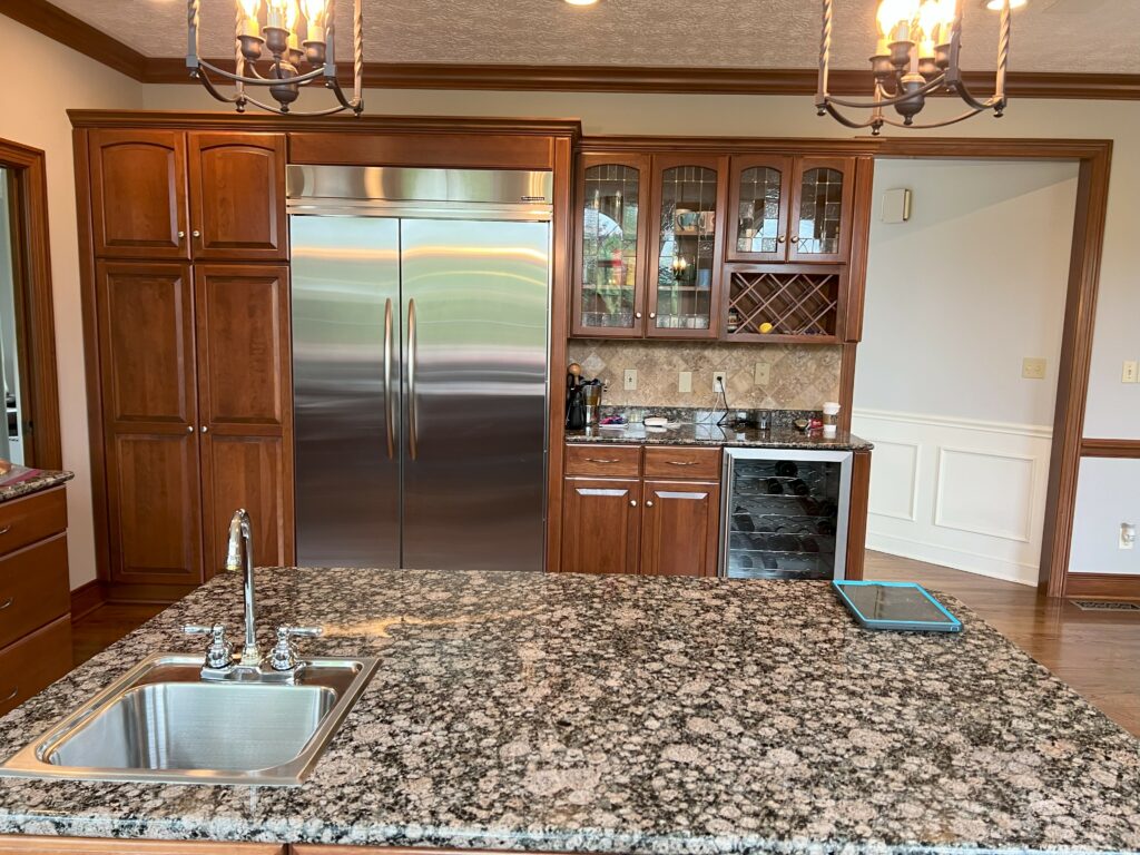
Here was the fridge wall before:
And here’s the after:
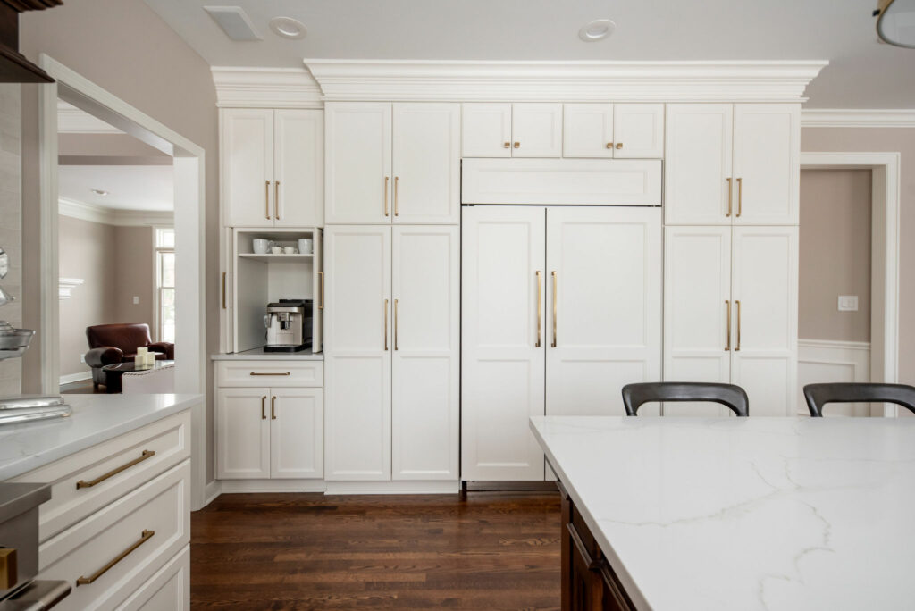
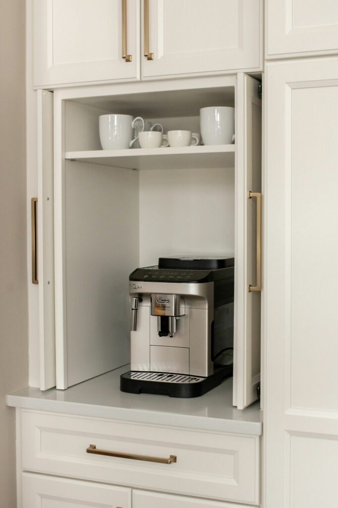
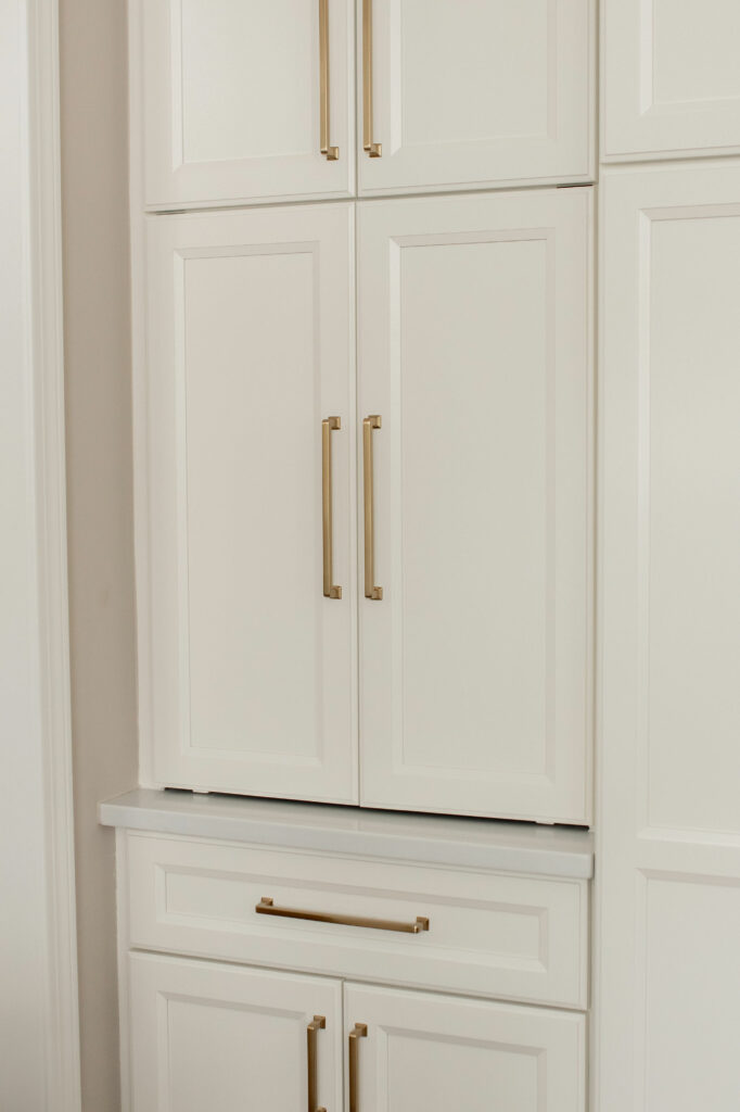
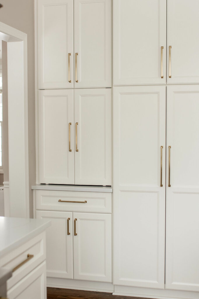
We opted for a paneled fridge so the cabinetry wall stayed seamless from end to end. The coffee station on the left can also close.
The big cabinets on either side of the fridge are nice and deep with pull out shelves for so much food storage!
Let’s talk counters. We chose a maintenance-free quartz for this space, since the owners are both very busy professionals with two children. It’s hard to see in the photos, but the quartz has some nice subtle taupe veining running through it that coordinates really well with the warm wood tones in the island and hood.
Here’s a before and after of the dinette space:
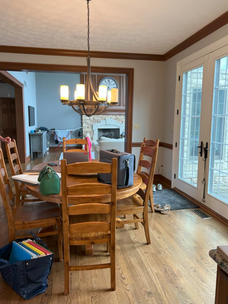
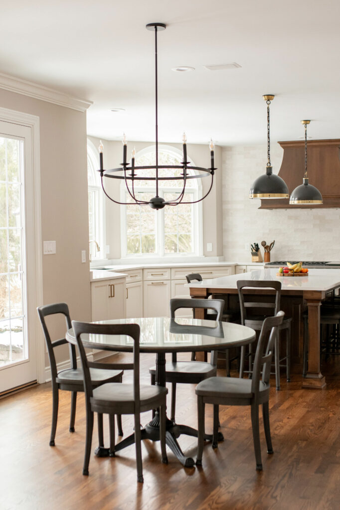
We replaced all that brown wood with a much richer, darker shade of wood. The chandelier went from rustic to sleek, as well. It’s large but visually very light, so it doesn’t create to much of a presence in the space.
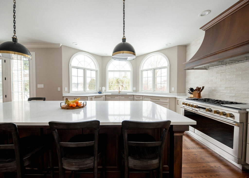
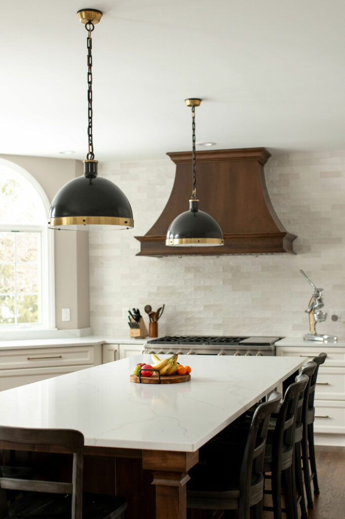
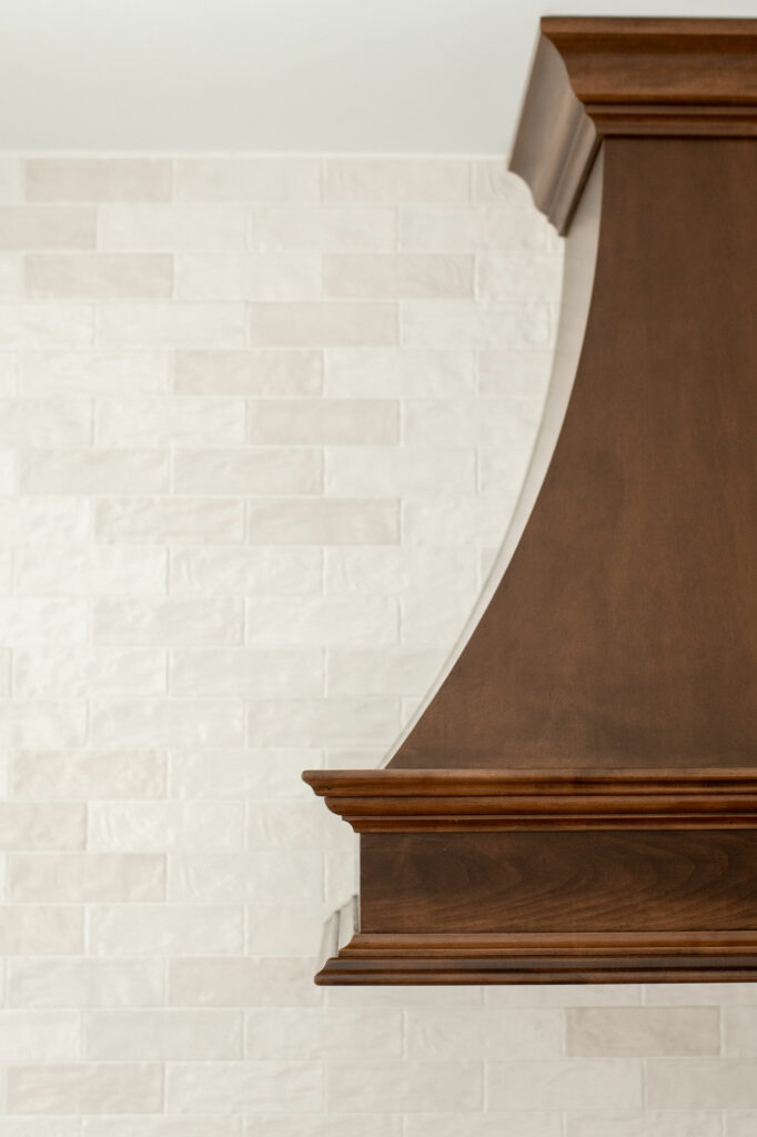
Let’s take a closer look at the new range hood. Instead of surrounding the hood with cabinetry, we let it shine as the sole feature on the wall. We also took the tile all the way to the ceiling for added drama!
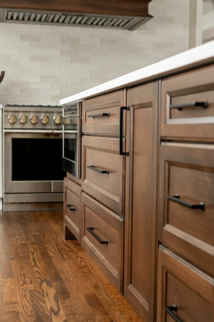
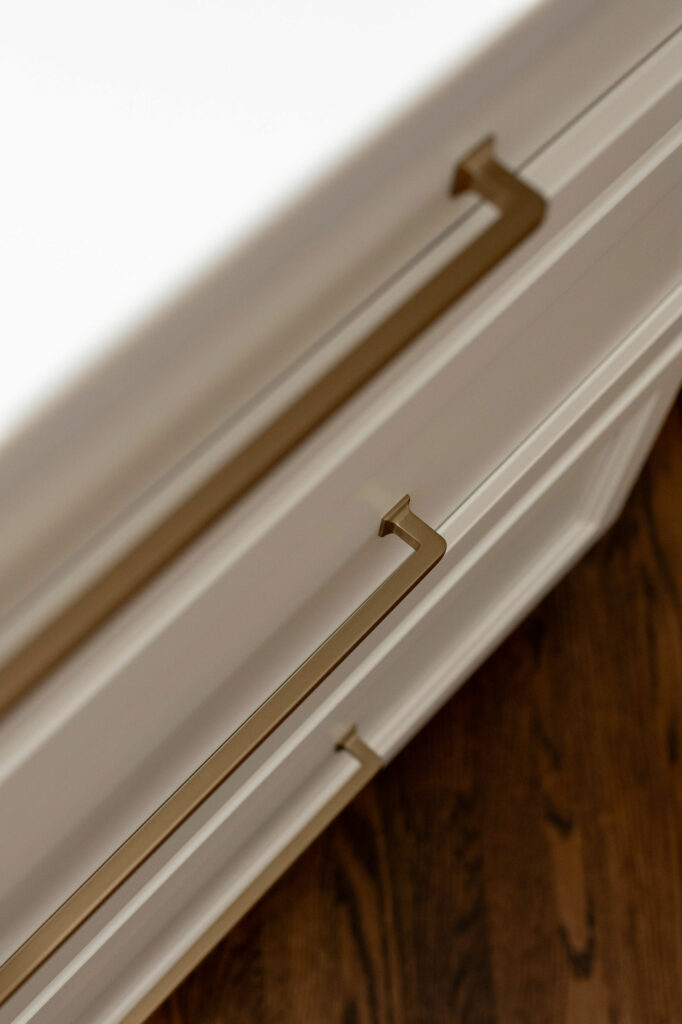
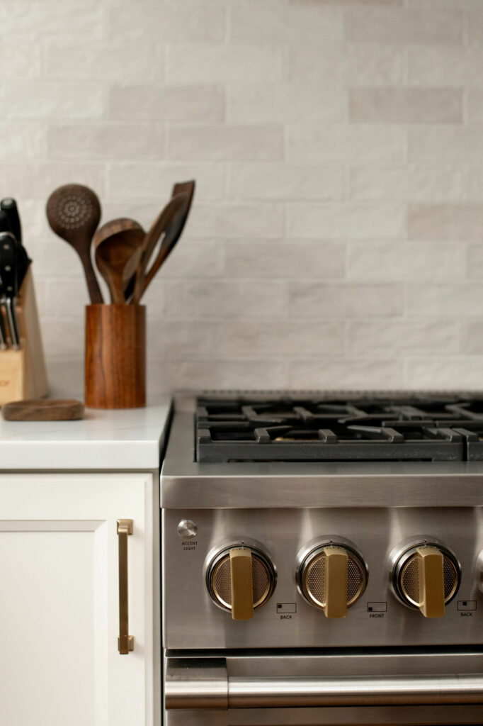
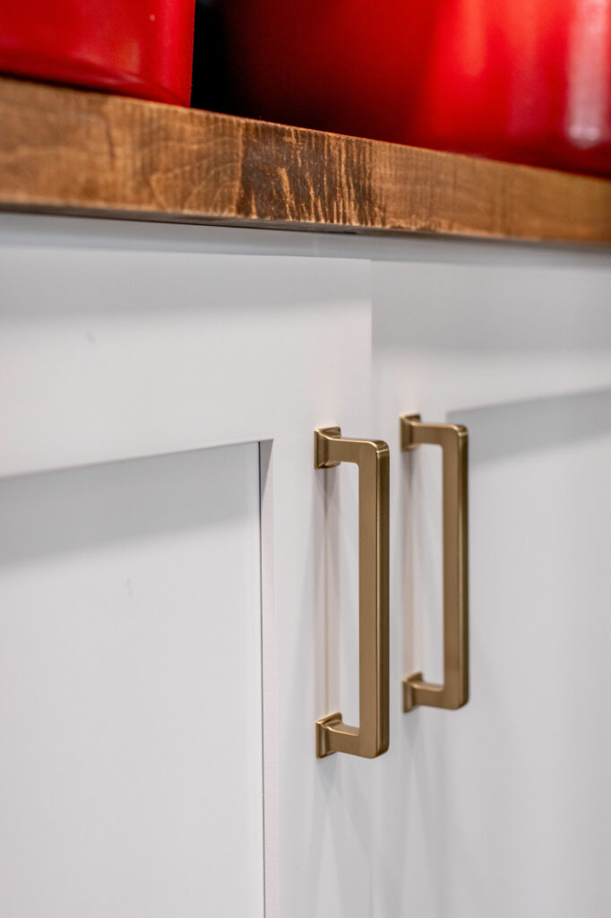
Our clients live in a very traditional home with gorgeous, thick moldings and classic details everywhere, but their style is really more contemporary. To bridge the styles, we brought in some contemporary pendants in black and brass. We also added sleek honey bronze hardware to the cabinets.
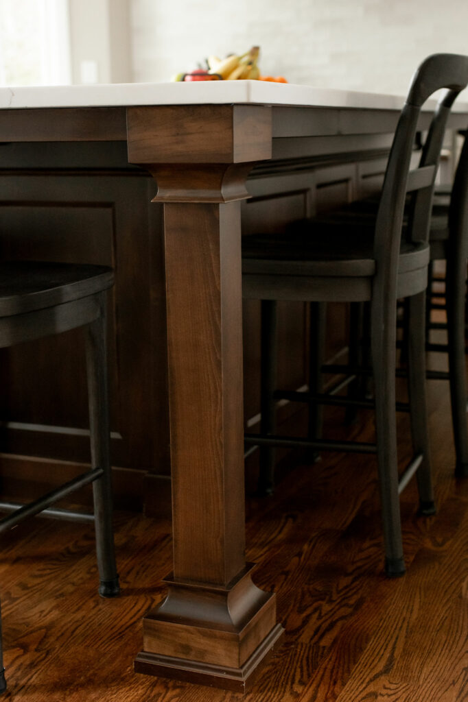
Instead of just using plain Shaker cabinets, we opted for a style with slightly more detail. We also brought in more visual interest with the island posts and panels on the sides and backs of the island.
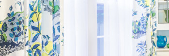
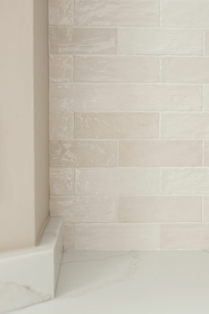
Here are some closeups of the kithen backsplash. It’s a porcelain tile with natural color variations from piece to piece. We went with a varied tile so the wall wasn’t just a solid white block in the space. That would have been rather boring against all of the other details in the home!
Here’s that coffee bar I mentioned earlier. See how the door shuts? You can barely tell there’s anything there!
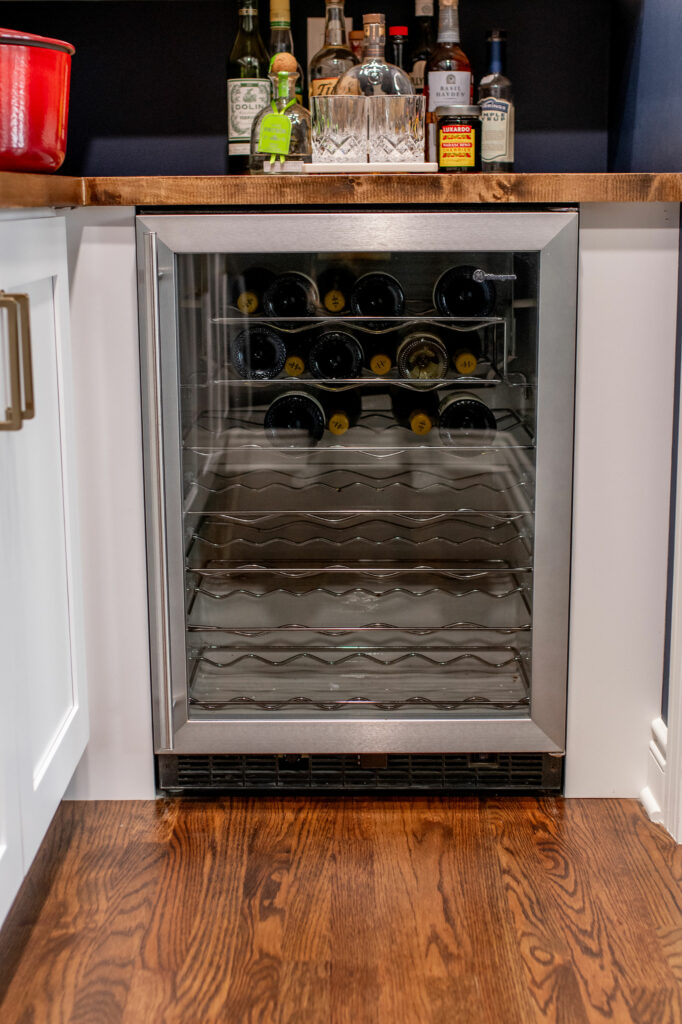
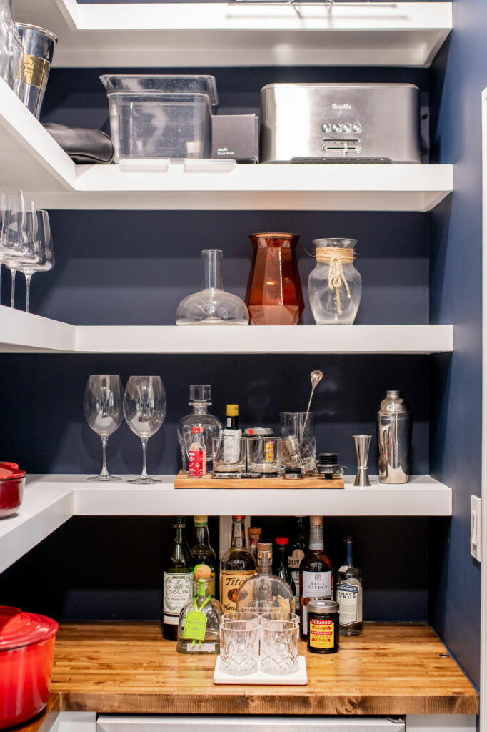
For even more practical storage, we sized down an adjacent office and added a butler’s pantry to the kichen, accessible through a sliding door. Our clients have a lot of large appliances and pots, so the shelfs in here are perfect for storage. Instead of keeping the room neutral, we opted to bring in some drama with a deep navy color, which ties into their nearby mudroom. The wine fridge is also hidden in this space, along with some other bar items.
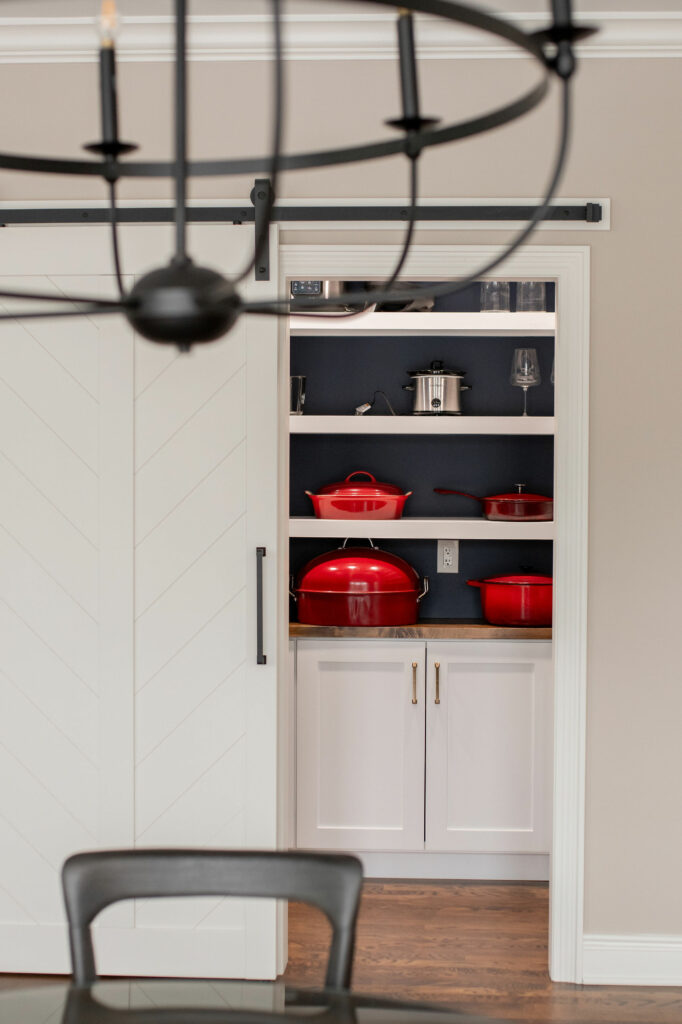
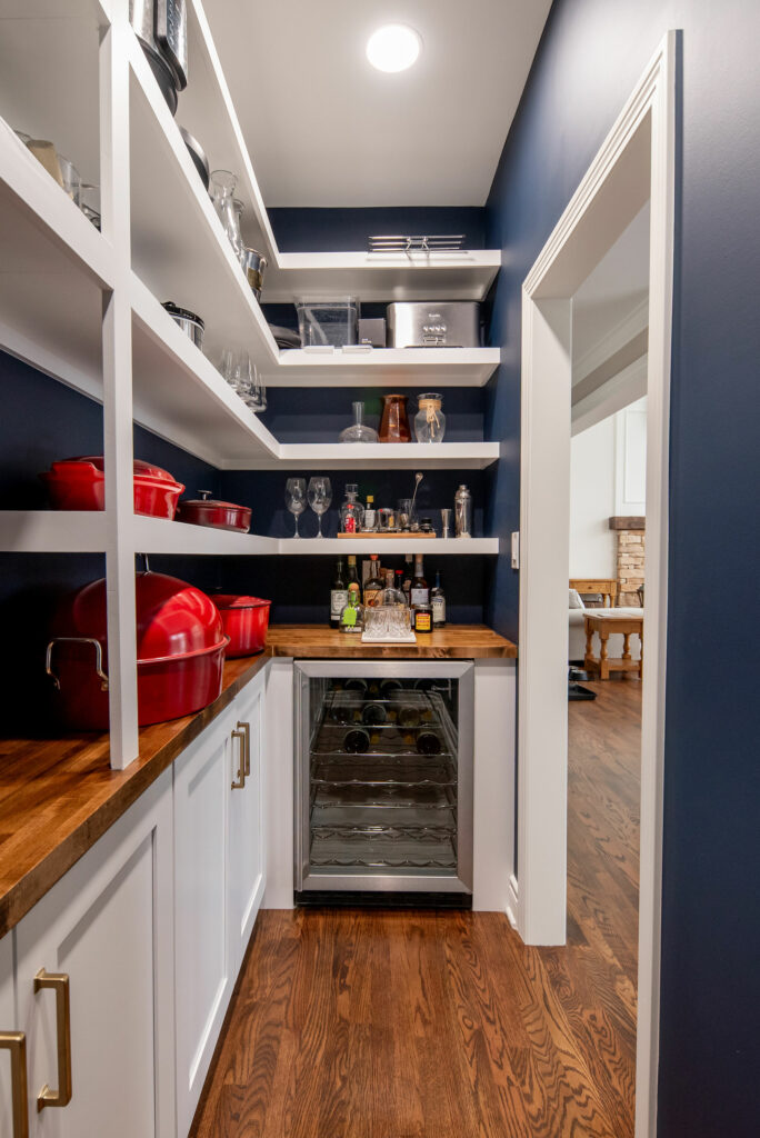
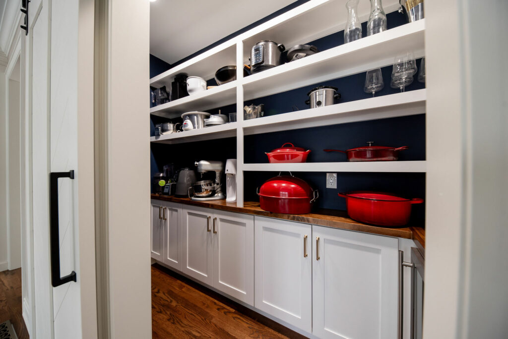
To make this space feel even more special, we opted for a butcher block counter that was custom stained to coordinate with the newly refinished wood floors.
Ready to transform your kitchen? Book a Discovery Call with us today!