
This Shaker Heights century home’s owners have a wonderfully collected sense of style! They just needed a little expert advice to take their home from “just ok” to “fabulous!”
Dining Room Design
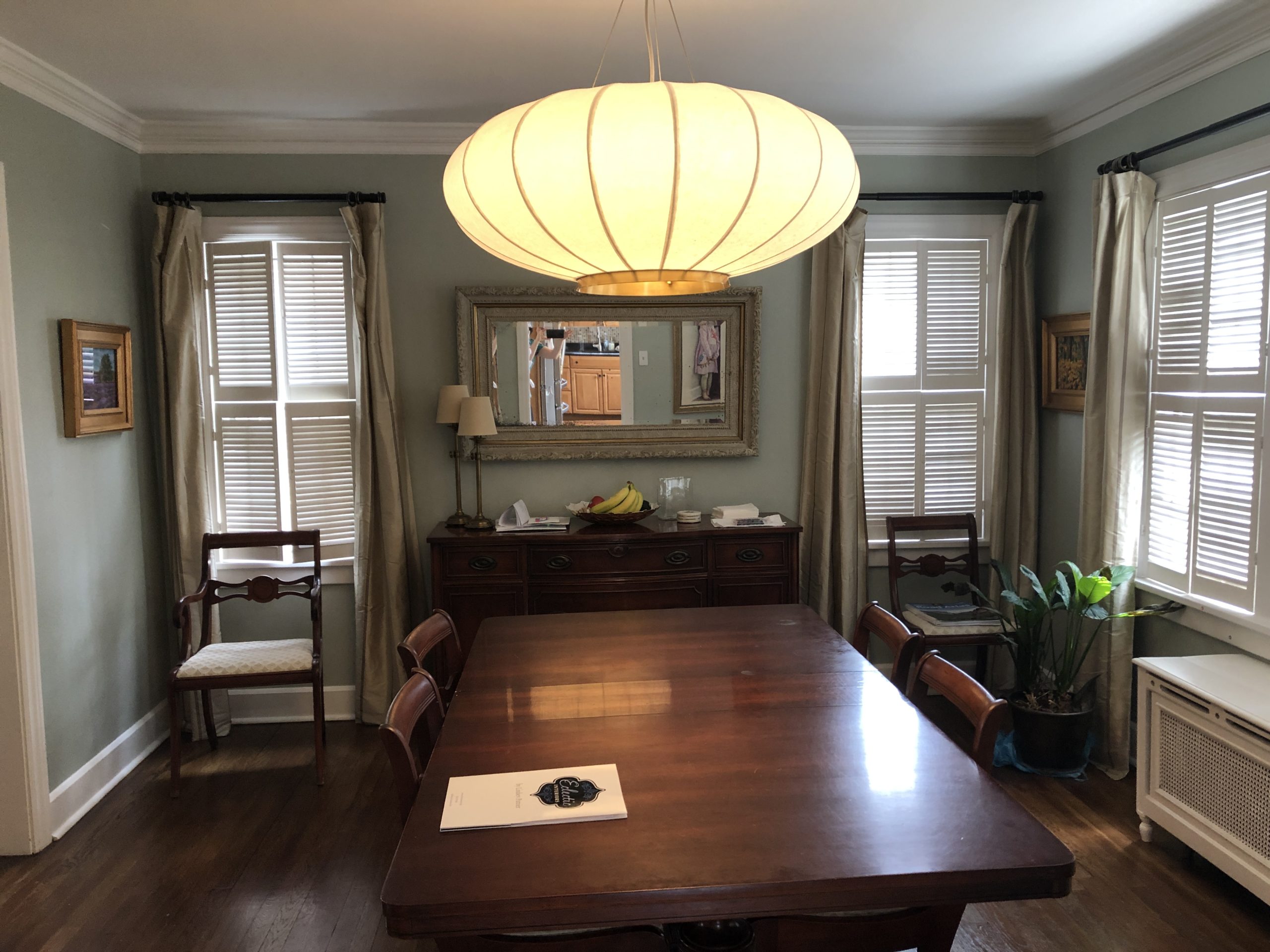
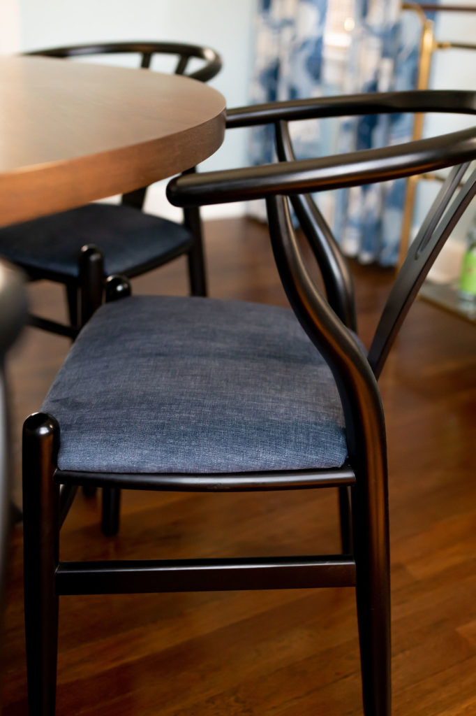
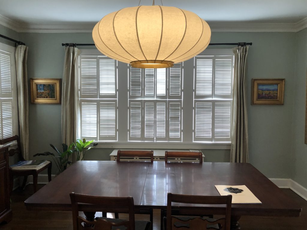
My clients were tired of their big dining room table and traditional chairs and wanted new furniture that wasn’t so heavy feeling. The windows were overrun with tiny shutters that were falling off the windows. The draperies were inherited from the previous owners, and my clients hated how they looked on the windows. The room’s color was also a bit drab for their taste.
Here’s the room before:

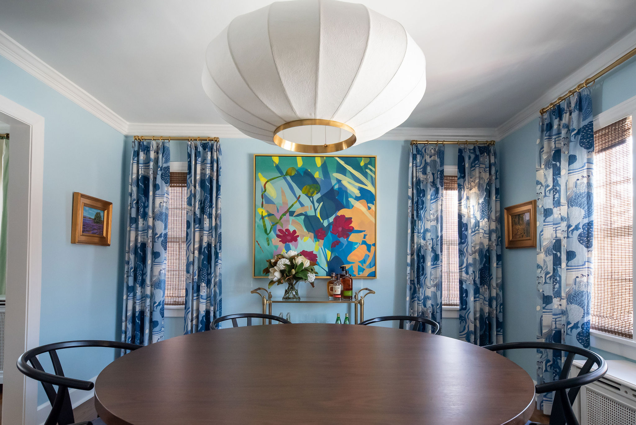
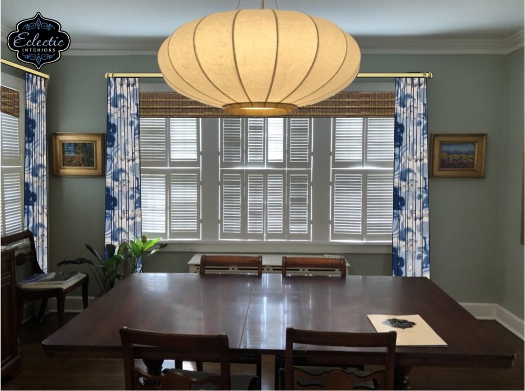
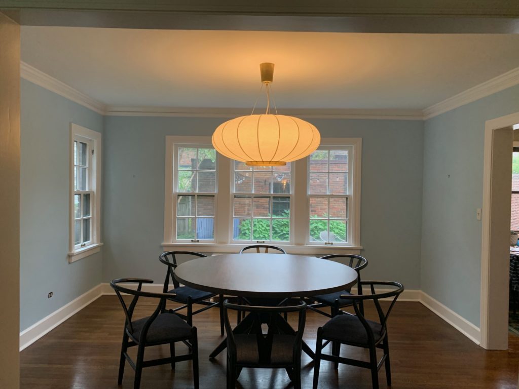
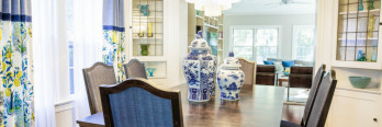
And so you’re not kept in suspense, here is the after!

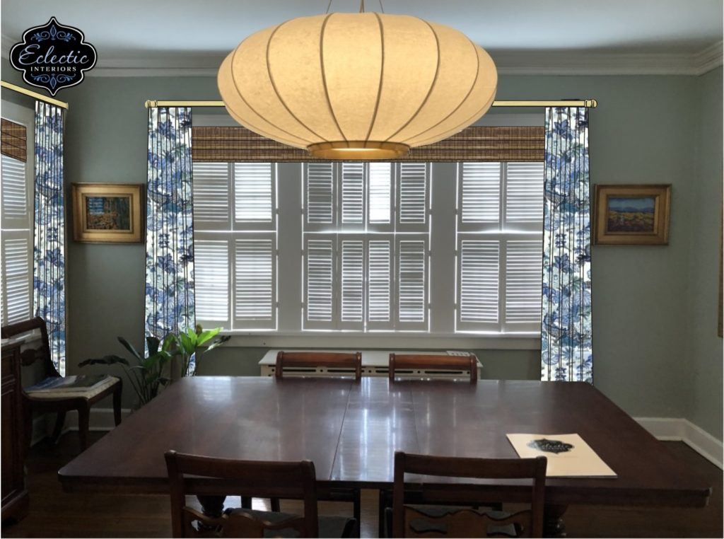
Just for giggles, let’s see these side by side:
Let’s take a minute to discuss HOW we got to the “after.” Design isn’t a 5-second process. It takes time to design the perfect space for my clients.
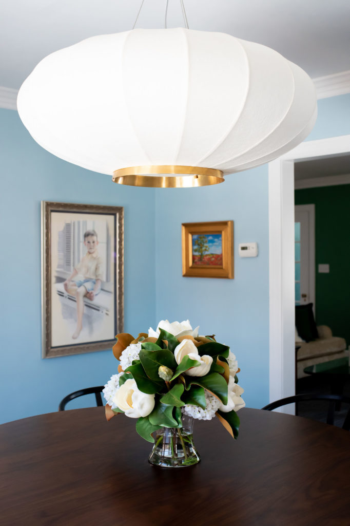
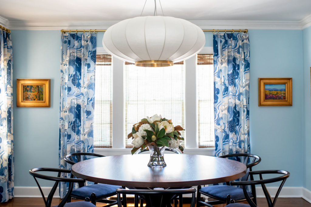
We started by discussing what my clients DO like in the room. They adore their large-scale, Asian-inspired chandelier. That was a great inspiration for selecting fabrics, furniture, and artwork.
My clients hated the shutters on all the windows, but they were functionally necessary to keep out the blinding afternoon sun. We discussed different options that would block the sun, and I recommended natural shades.
We then discussed color. Like the vast majority of my clients, these clients wanted to add more color to their space. They had quite a bit of blue in the adjacent living room, but the dining room was mostly all neutral. They wanted to bring in some more blue to the space, and possibly some green.
Next, we discussed fabric design. I had brought some fabric swatches with me for inspiration, and we talked about what kinds of patterns they were drawn to (florals, Chinoiserie, Asian themes), and which they didn’t like (geometric, stripes).
After the meeting, I did some additional fabric sourcing and created renderings of several different fabric options for their review.
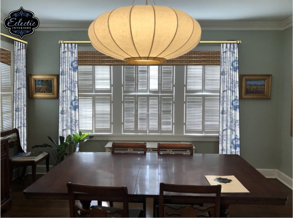
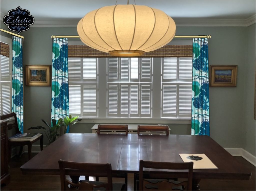
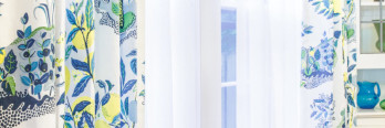
After some contemplation, we decided on this fabric and shade combination:
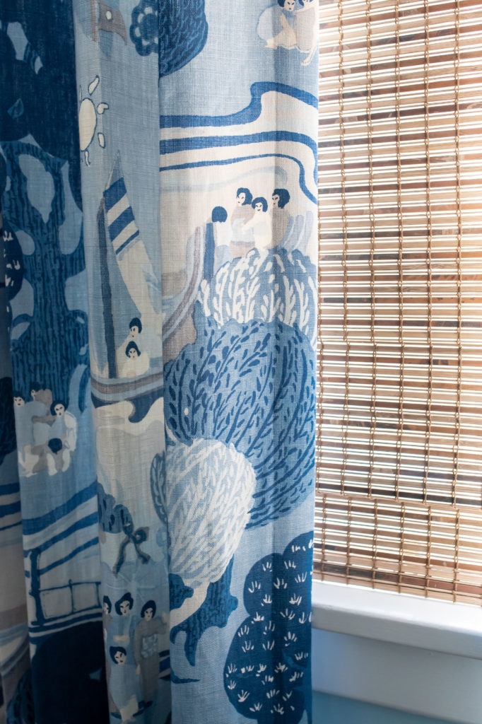
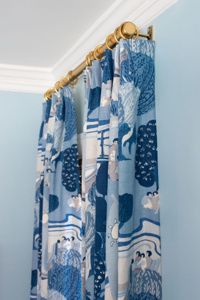
The consistent theme with the chandelier, table, and chairs is the roundness of the items. The rounded trees on the fabric mimic the roundness found elsewhere in the room.
To replace those awful shutters, I recommended adding some internal mount natural shades to the windows.
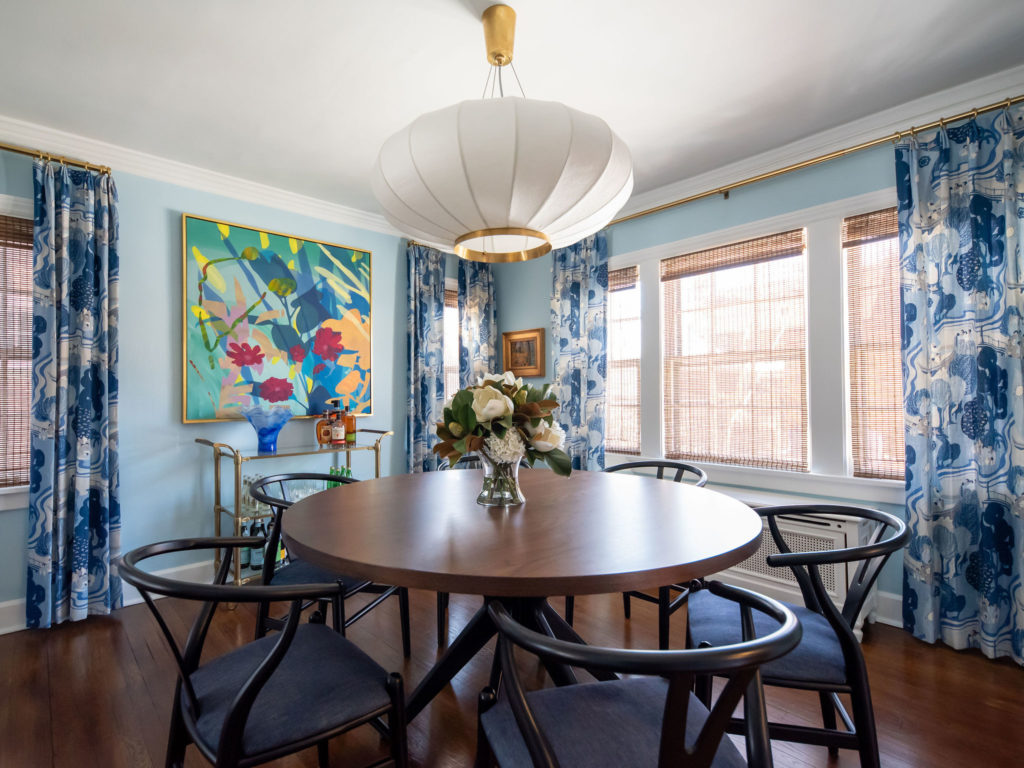
These shades are top down/ bottom up, which means you can open both the bottom and the top, depending on your privacy needs. The shades are just opaque enough to block the blinding afternoon sunlight and provide privacy, without turning the room into a constant cave.
Below left is the “before,” complete with all of those shutters. Below right, the shutters have been removed and the walls painted a lighter, brighter blue.
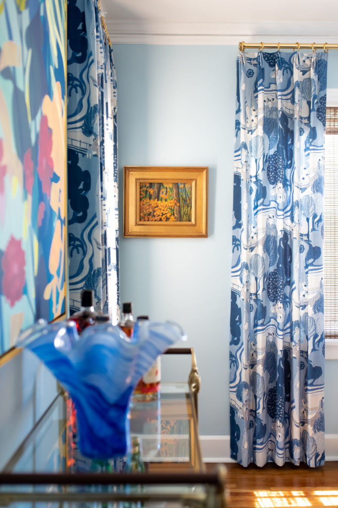
How did I choose the color for the walls? I pulled it right out of the fabric. Let me repeat: I used the fabric as inspiration for the wall color. Why didn’t I select the wall color first? The right fabric is MUCH more difficult to find than paint! Always select your paint color last.
Here’s another after photo, for your viewing pleasure!
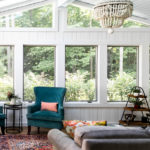
Living Room Makeover
Let’s move into the living room.
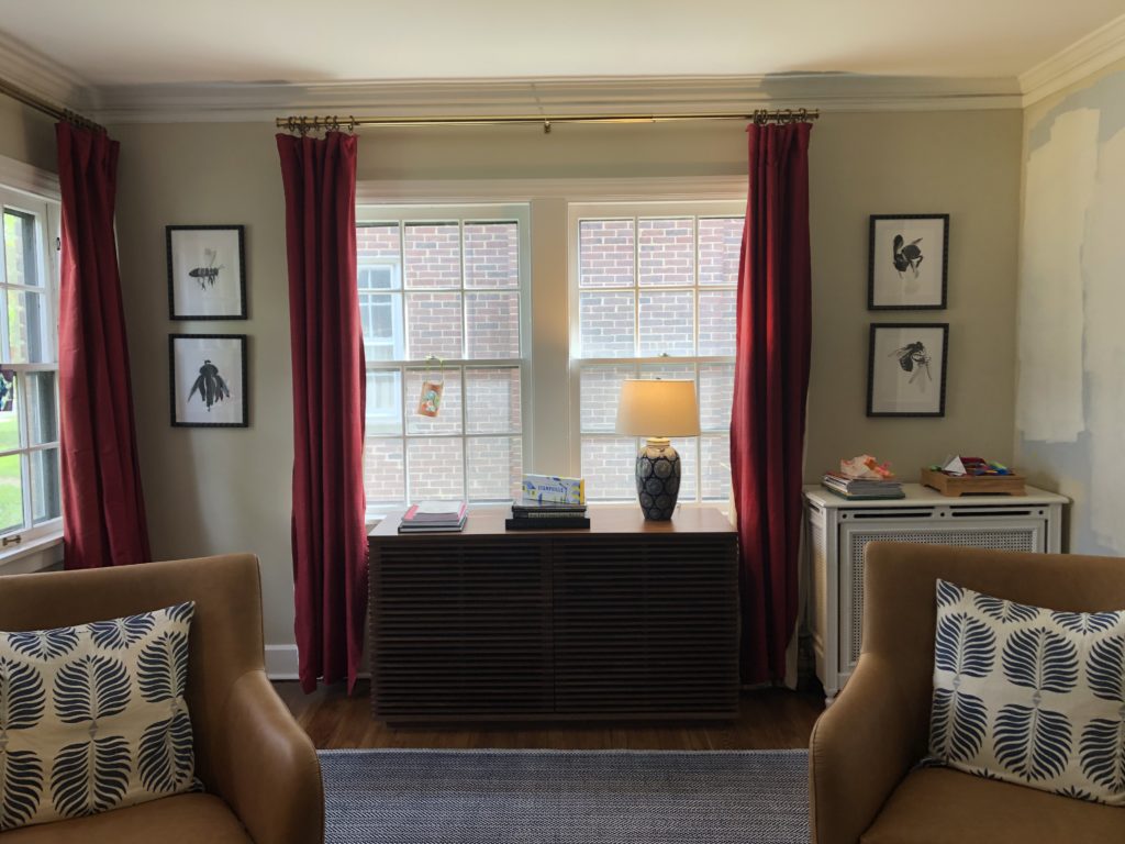
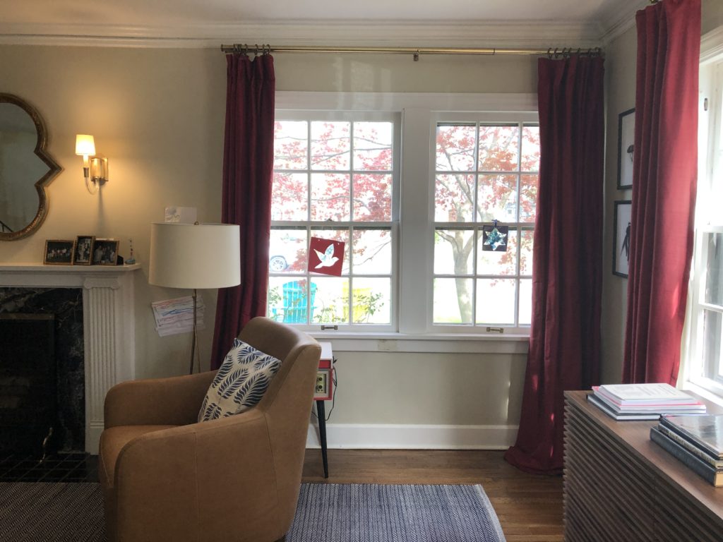
My clients hated the red drapes (also left by the previous owner). Red is not their color. Plus, the drapes had been washed and shrunk. (Side note: DO NOT WASH YOUR DRAPES! Vacuum them lightly without a beater bar to remove dust. That’s all they need.)
The walls were a sad shade of cream. As you can see on the right side of the photo below, my client had tried to come up with a better color, but they weren’t having any luck.
I’m not going to show you the “after” right away for this one. First, we need to walk through the design process so you understand how we got to the end.
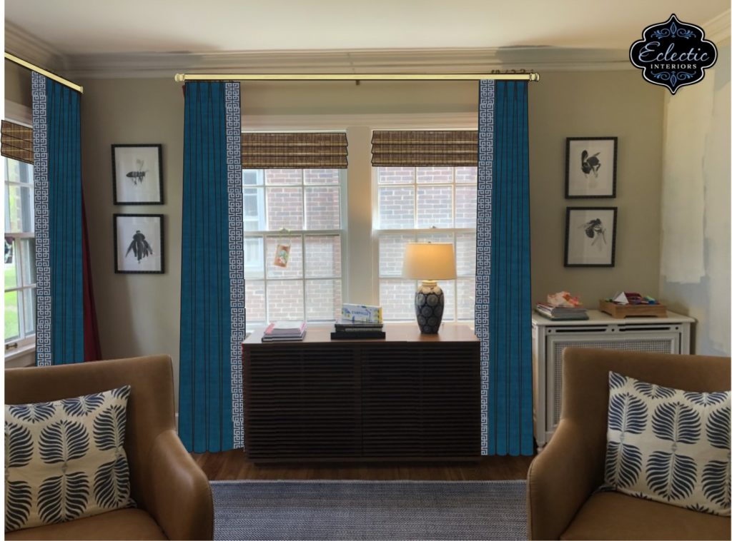
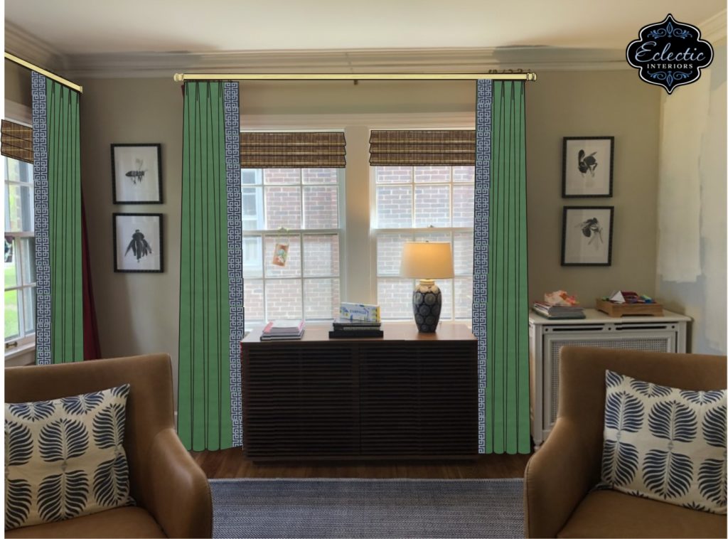
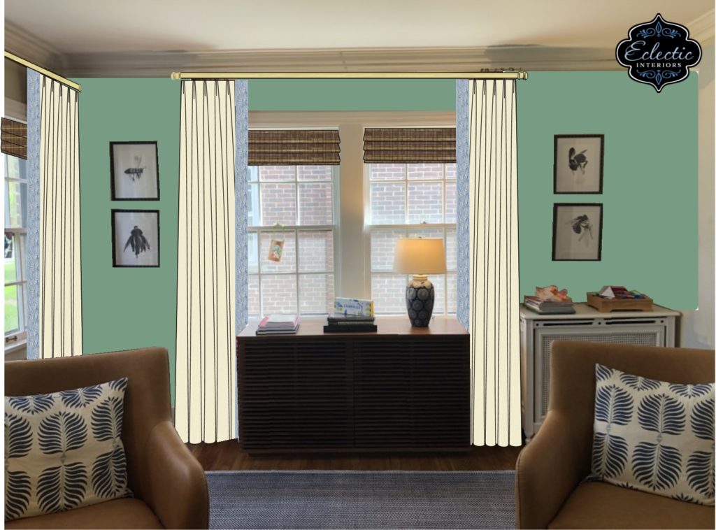
My clients’ first thought was to keep the walls neutral and add some colorful drapery panels in either blue or green. I recommended adding some fun trim for more visual interest, and they loved that idea.
Here are two of the original designs I came up with – blue and green solid draperies with a white and blue trim.
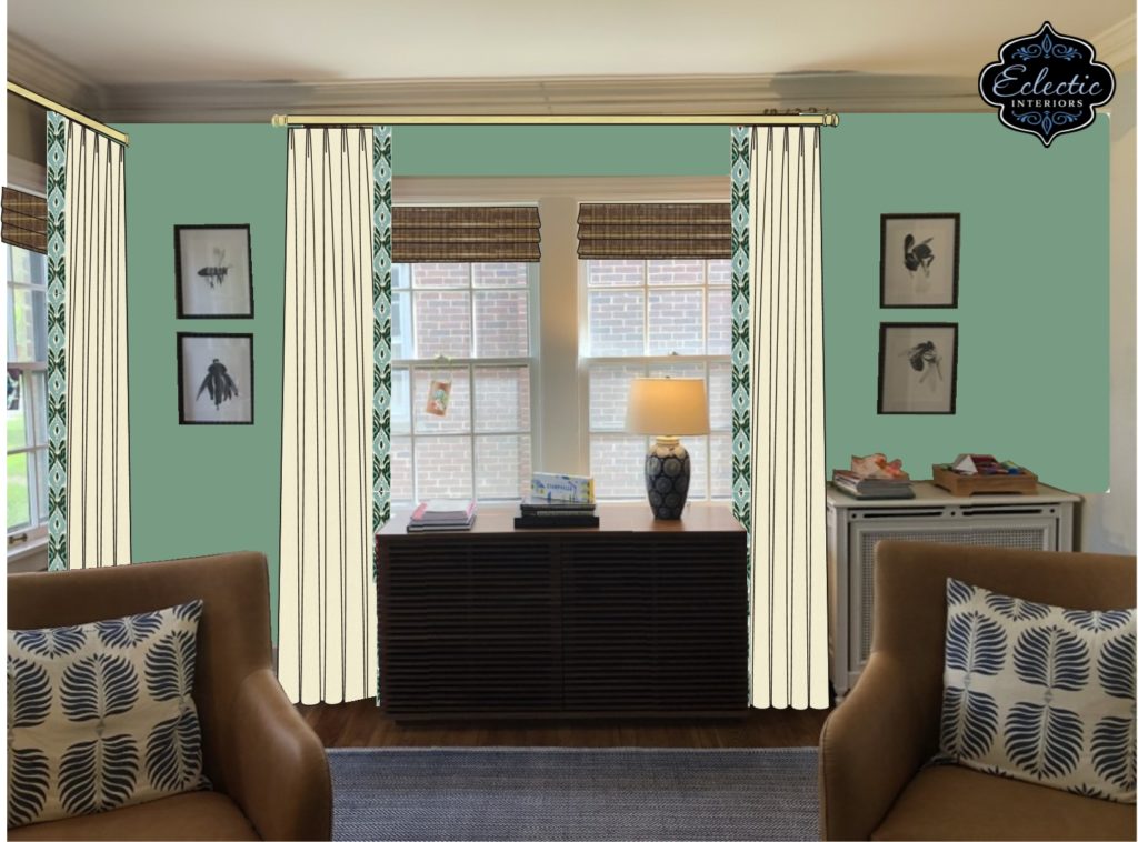
As I was designing, though, I kept going back to the idea of having a color on the walls. My clients’ furniture is neutral – brown cabinet and chairs, off white sofa, glass table, etc. – so I knew painting the walls a color wouldn’t turn the room into an obnoxious, colorful overload.
Because my clients already had a blue rug and blue pillows, I thought green might be a good choice for the walls, since this was another color my clients indicated they wanted to incorporate into their home. Hence, the two new renderings below!
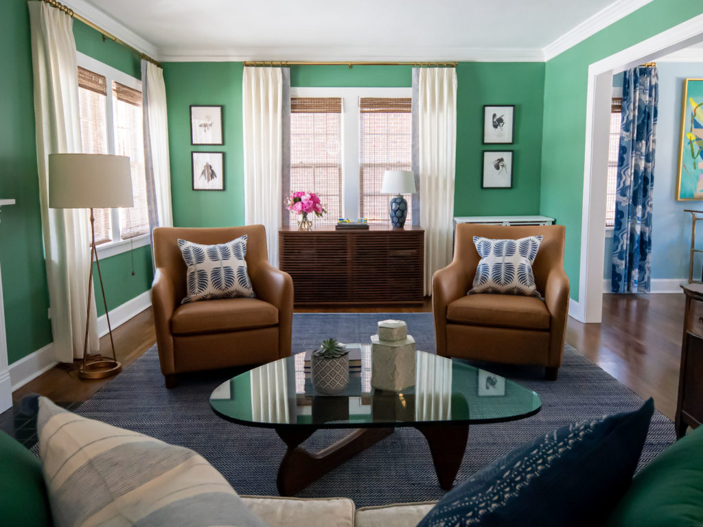
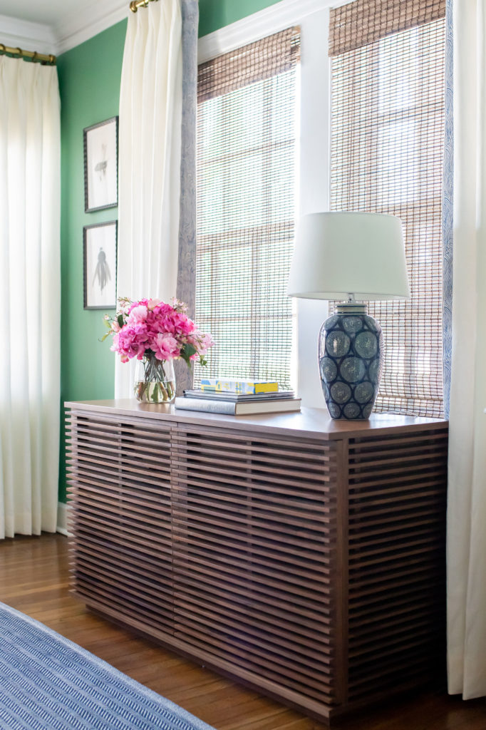
I went with a soft, light-to-medium green that goes really well with all of the darker navy blue in the room. It’s also not so dark that it’s going to suck all of the light out of the room. (Unlike the dining room, this room isn’t positioned to get nearly as much natural sunlight.)
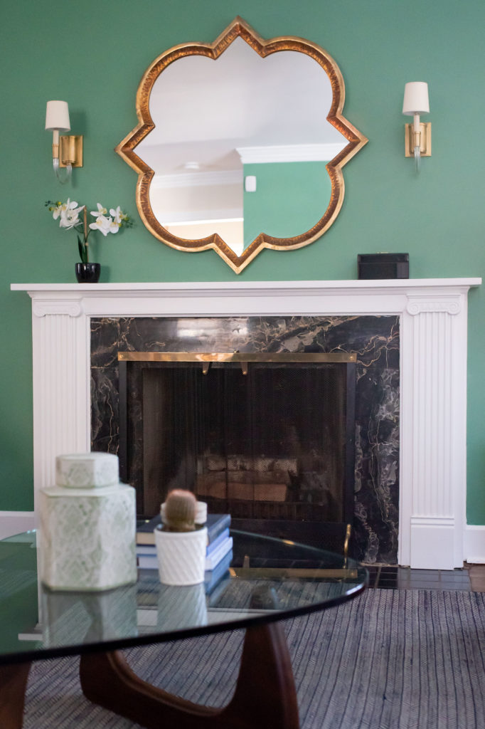
My clients LOVED the green, so we went with it! Here’s the after:
Here is a side-by-side before and after so you can really see the power of paint and window treatments:
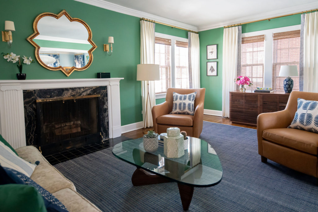
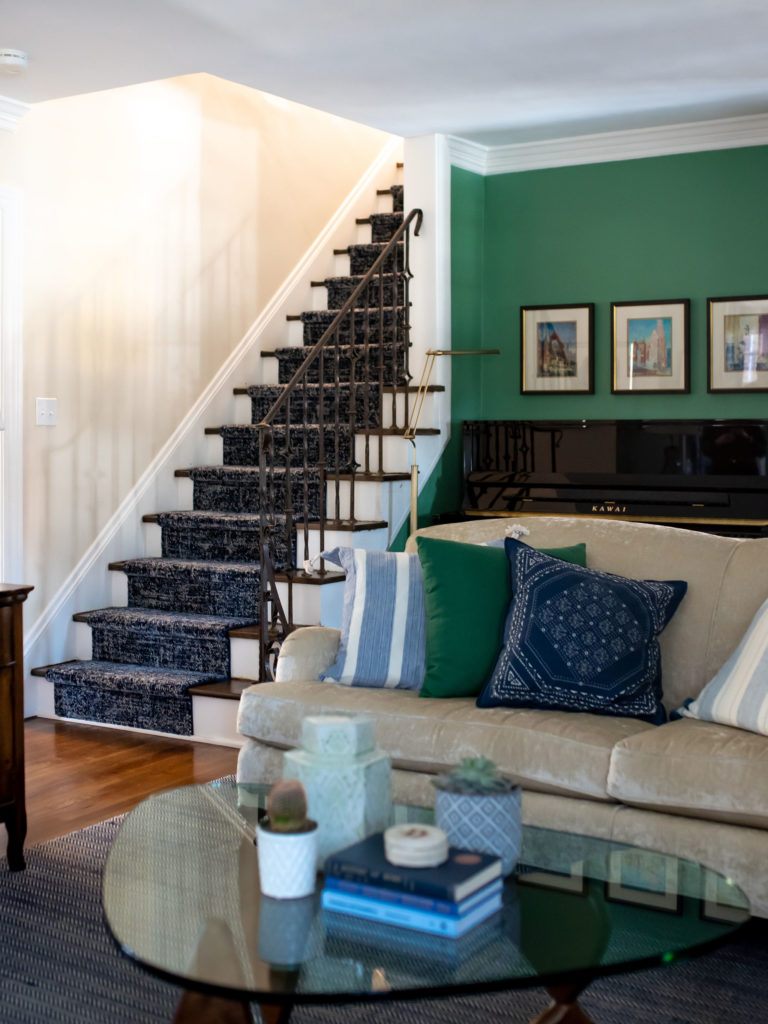
Everything else is the same. As I mentioned before, these clients have great taste in furniture! The green livened up the entire space and brought the furniture and décor to life.
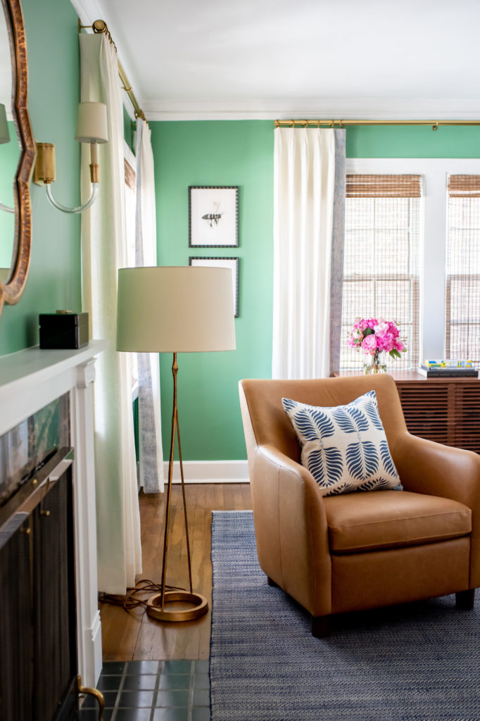
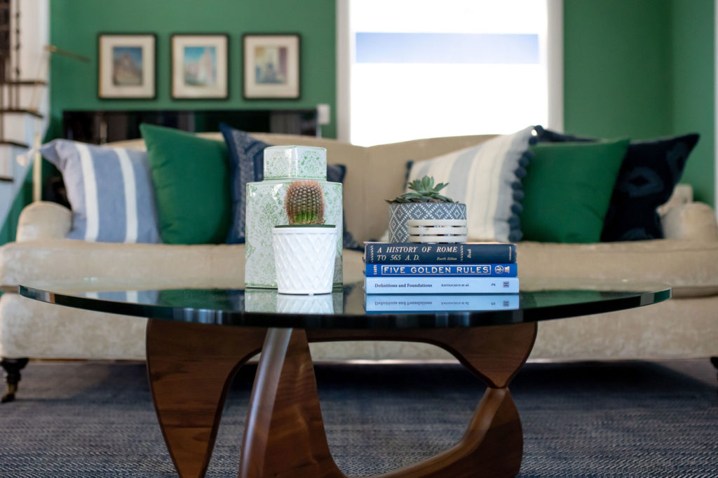
To ensure the color looked purposeful, and not random, I also recommended adding some green pillows to their existing blue and white ones. (They also had some old brown pillows that I recommended retiring – I forgot to take a before photo of those, though, so you’ll just have to trust me on that one.)
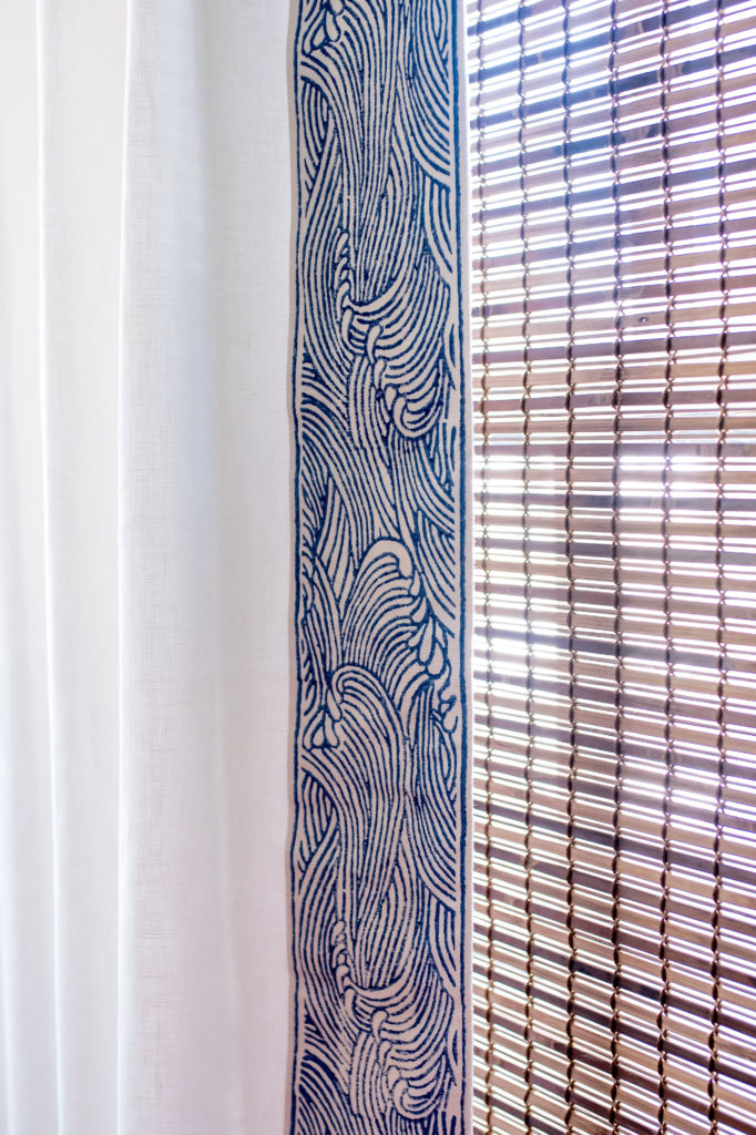
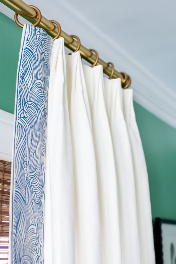
Back to the window treatments, here are some closer shots of the beautiful trim and fabric. The swirly wave/cloud pattern on the trim ties in perfectly with all of the round shapes in the adjacent dining room.
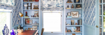
Stairway Runner Redo
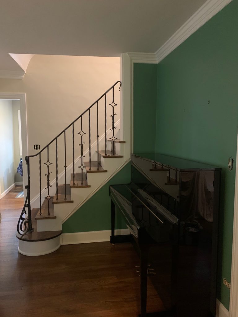
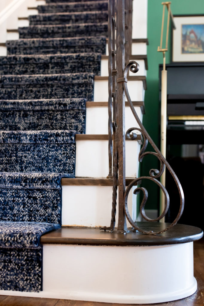
The last update we tackled also made a big impact to the space! My clients’ 100-year-old stairway needed a bit of a spruce. The stairs had been painted over multiple times, and various carpet runners over the years had left staples and nail holes in really odd places.
I recommended having the wooden treads refinished in a dark stain to coordinate with the original wood floors. I also selected a blue and white runner to coordinate with the other blue and white elements in the home.
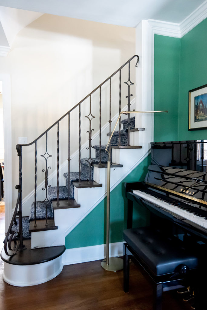
Isn’t this fun? It’s more contemporary than what you might think would work in a century home, but not so starkly modern that it looks out of place.
I hope you enjoyed this behind-the-scenes look into how the design process looks! If you’re feeling like your home needs a spruce, contact us! We’d be happy to help you bring out the best in your home.

Brook
| 20 July 2024I am obsessed with the wave trim! Can you share where you found it?