There’s nothing quite like a kitchen transformation to breathe new life into a home. When we took on this project, we knew we wanted to keep the charm of the original space while upgrading it with a fresh, modern feel. The goal? A kitchen that’s as functional as it is stunning. And it has to work with the rest of the house.
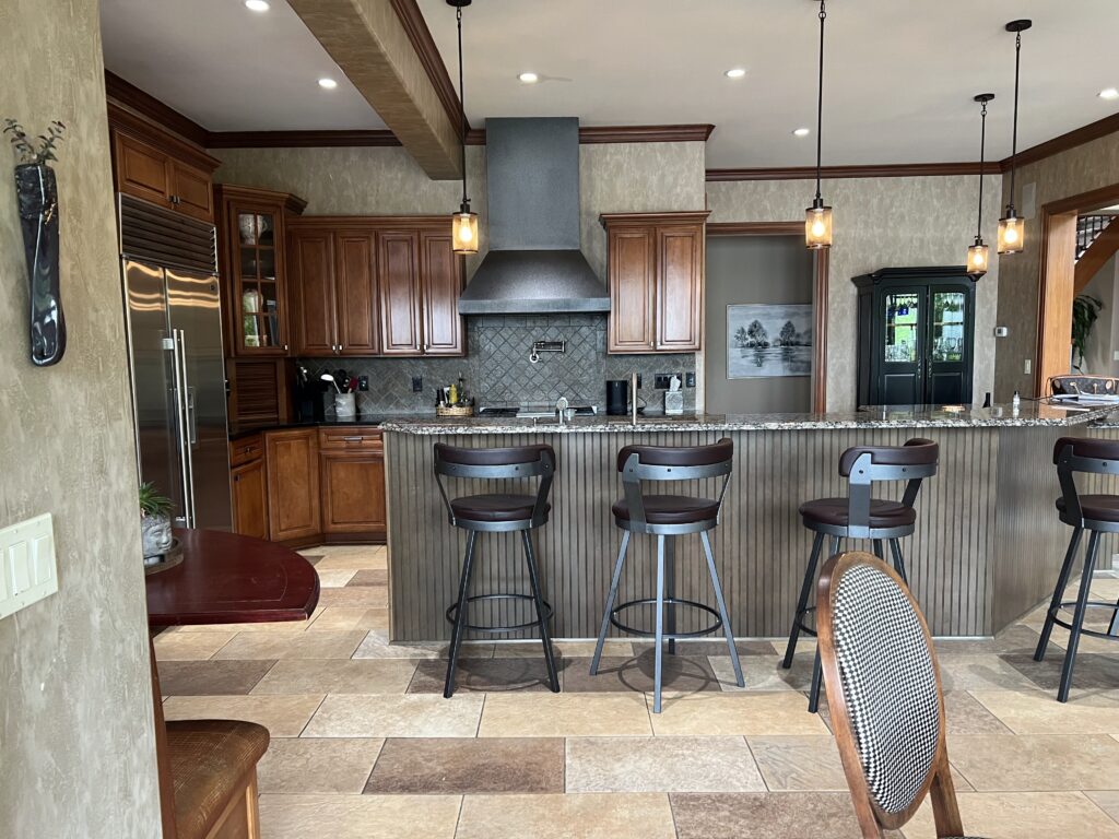
Before: A Good Kitchen That Needed a Refresh
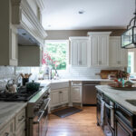
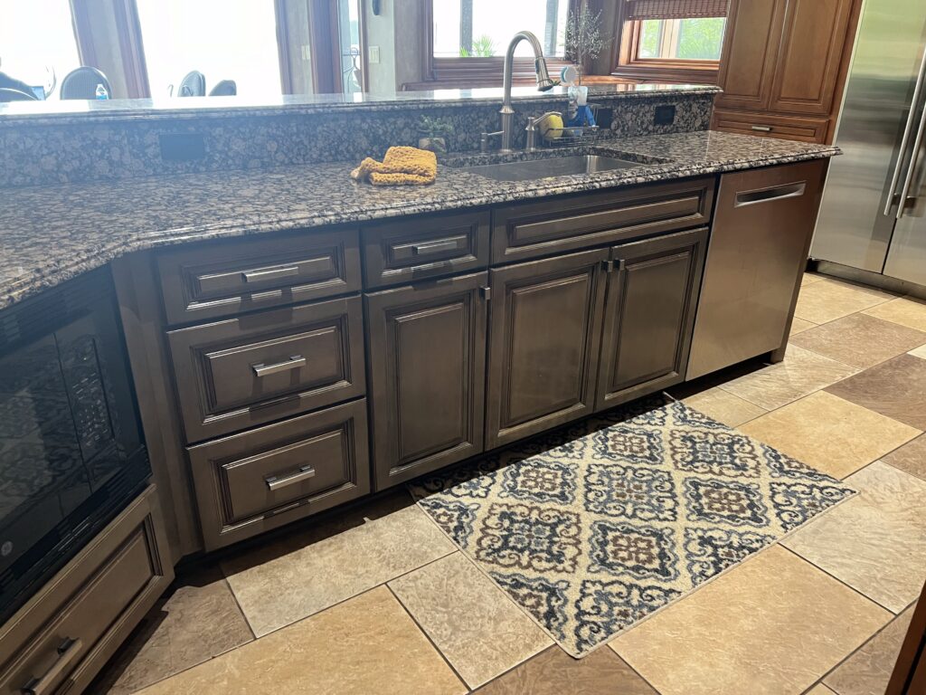
The original kitchen had great bones – plenty of space, beautiful woodwork, and a cozy atmosphere. But it also felt a little heavy. The dark tones, traditional finishes, and busy countertops made the space feel a bit dated.
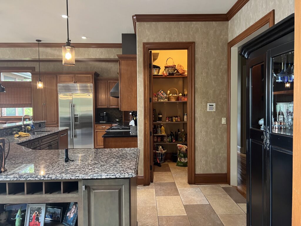
The pantry felt undersized for the space (see below left). And that giant medallion above the chandelier? Who knows. We just knew it had to go.

The island layout was also rather questionable, with a very large, very oddly shaped island that took up a huge portion of the kitchen.
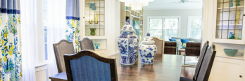
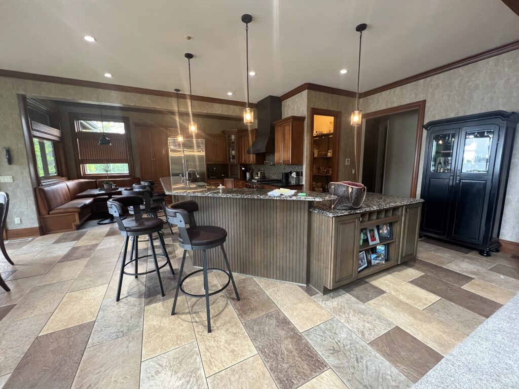
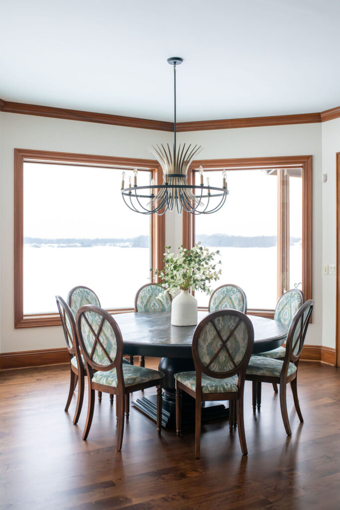
The kitchen definitely lacked the wow factor our client was craving, but our client really didn’t want the new kitchen to look out of place with the rest of the traditional space. Here’s the adjoining great room, which we didn’t touch:
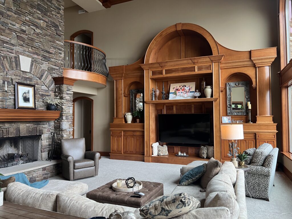
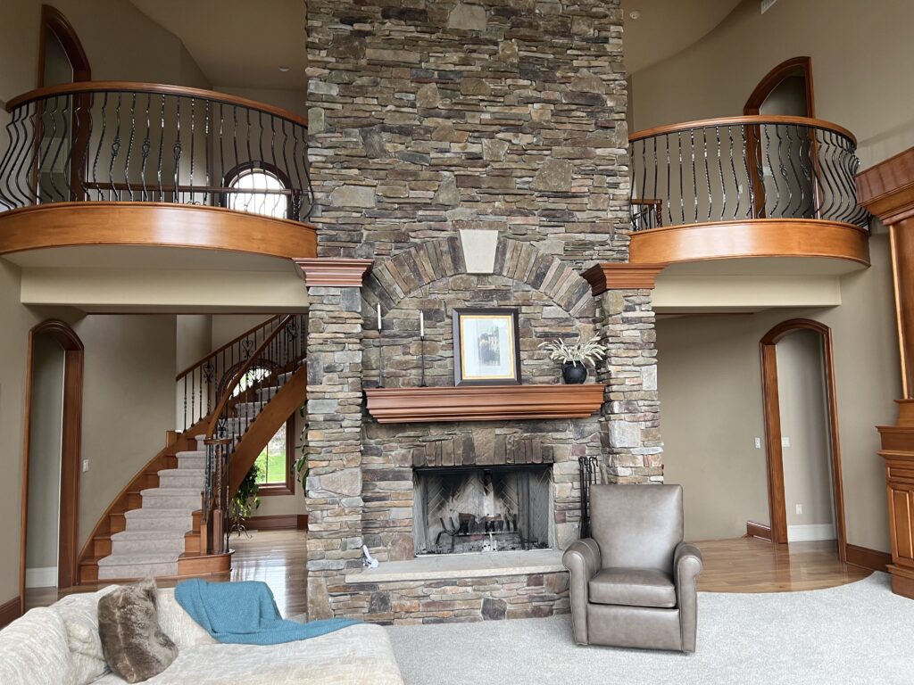
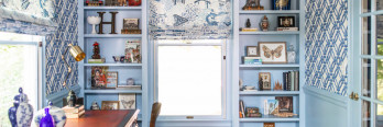
There’s a lot of warm woodwork throughout the house, including in the kitchen, so we needed to make sure the new kitchen design flowed well with the existing woodwork. (Yes, we could have painted everything in the kitchen, but then the rest of the house would have felt so different. It’s much more cohesive to keep the existing trim as-is and design a kitchen that works with the trim.)
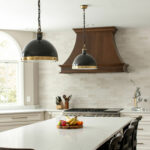
After: A Bold and Balanced Makeover
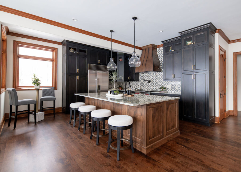
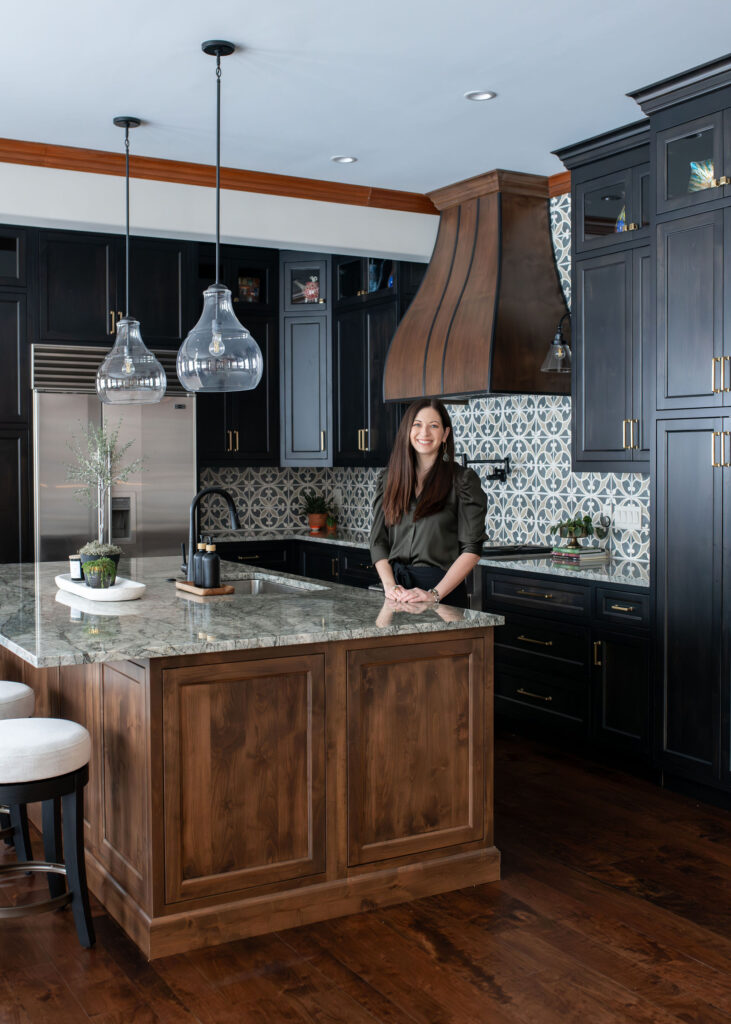
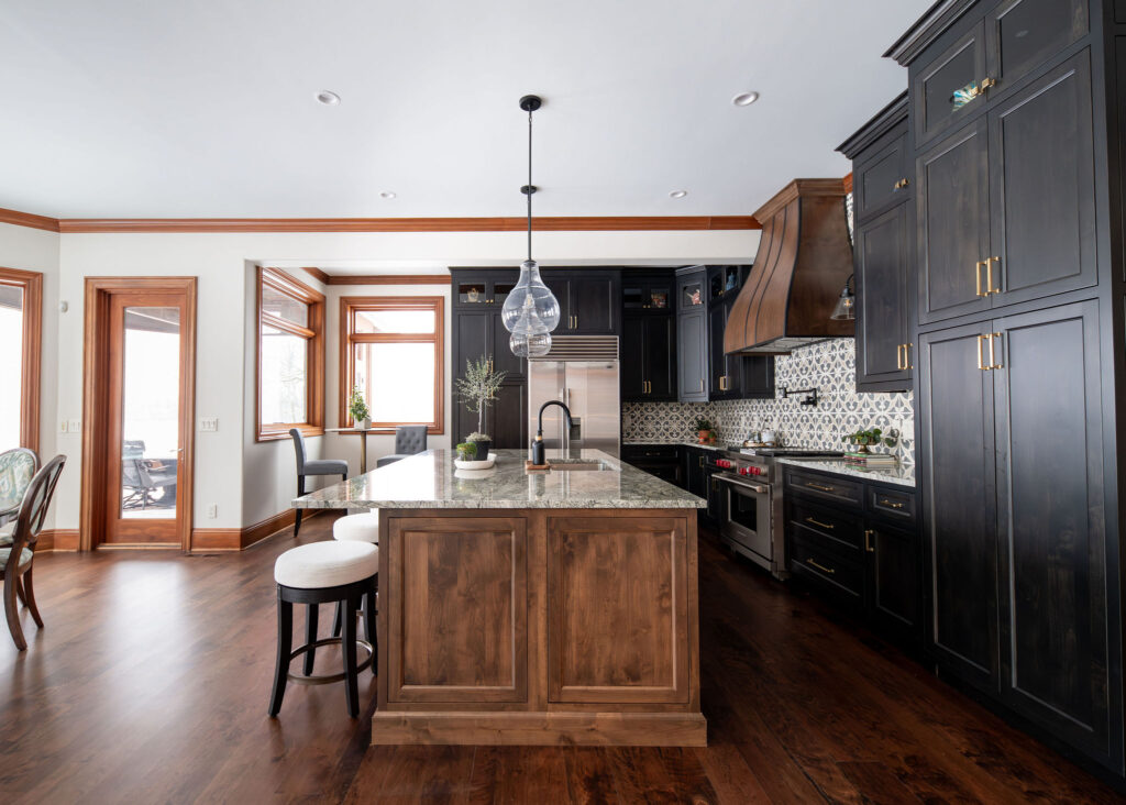
Enter the new kitchen: a bold mix of black cabinetry, warm wood tones, and eye-catching tile.
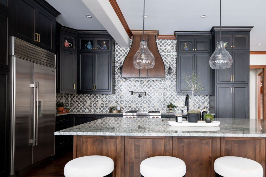
We brightened up the space by repainting the walls, swapping out the lighting, and introducing a fresh contrast of deep, moody cabinets with warm wood accents.
It’s hard to tell from just an after photo, but we also extended the stove wall. This allowed us to add more cabinets to the kitchen, as well as extend the pantry. Here’s a side by side view:
We went with a two-toned cabinetry design and a much smaller island.

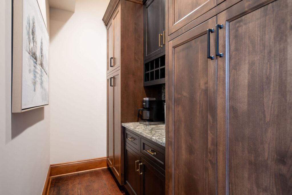
We continued the two-tone look into the newly expanded butler’s pantry, which features much more practical storage than what was in there before. Here’s the before:
And here’s the after. Now the door can stay open without highlighting a mess!
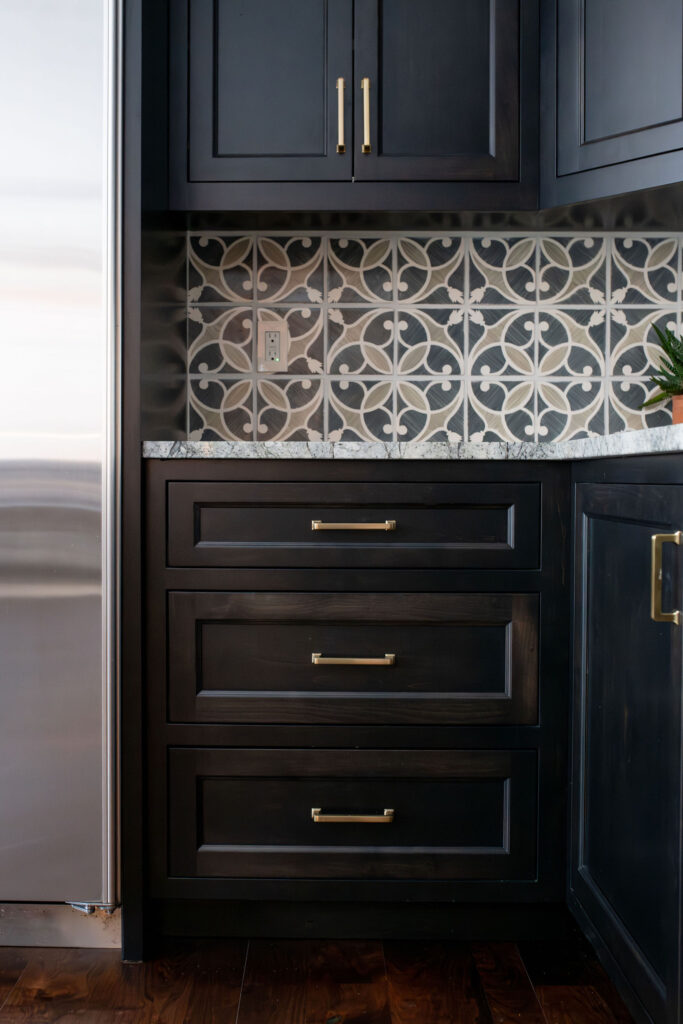
If you look closely, you can see the wood is actually a black stain that allows some grain to show through, rather than an opaque black paint.
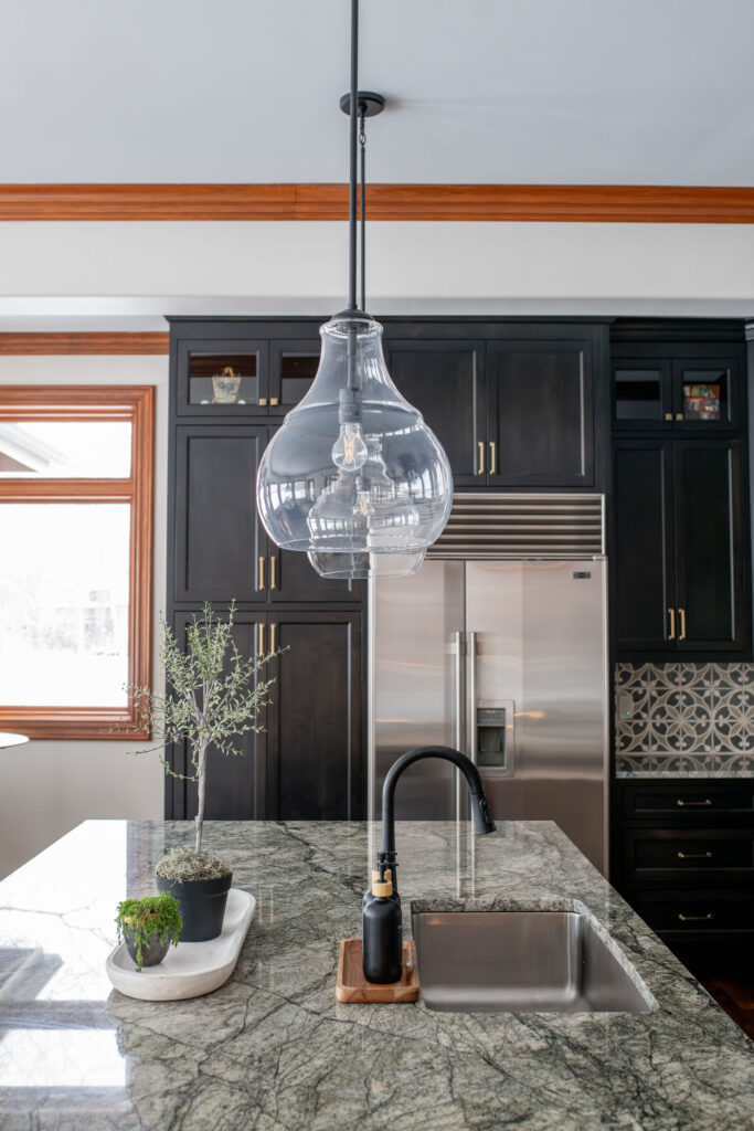
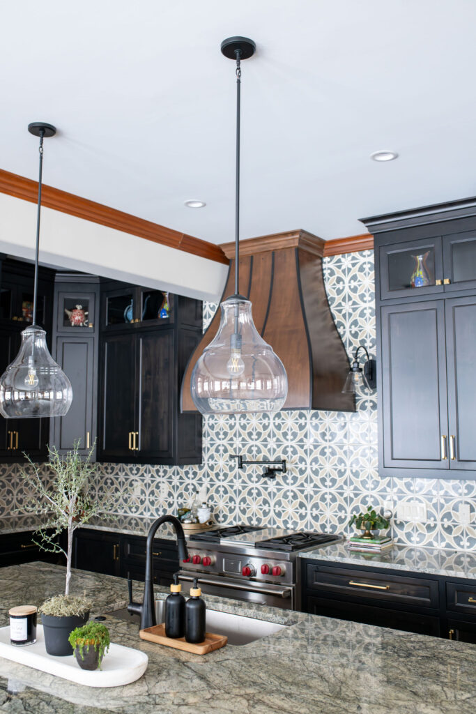
The island now serves as a striking centerpiece, featuring rich wood cabinetry, a polished stone countertop, and comfortable seating.
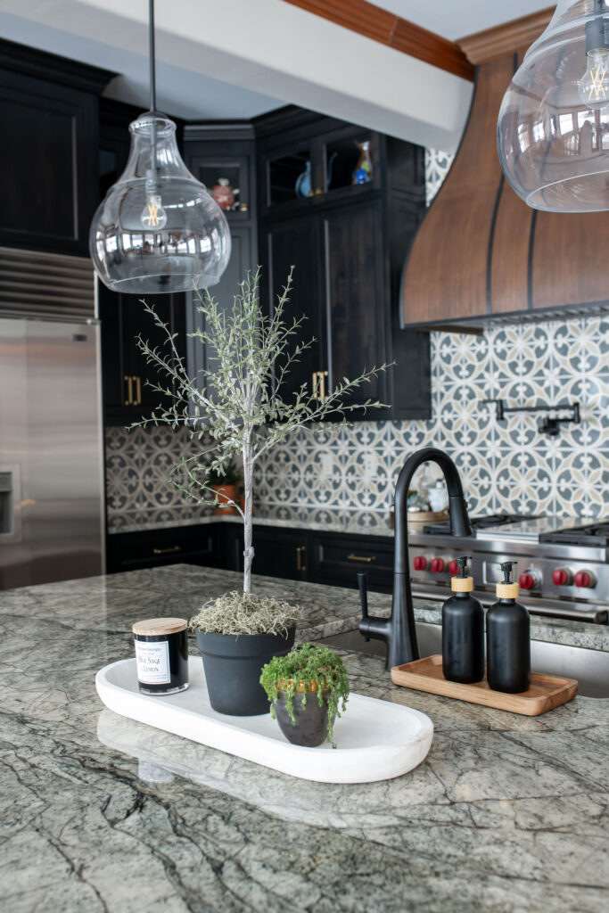
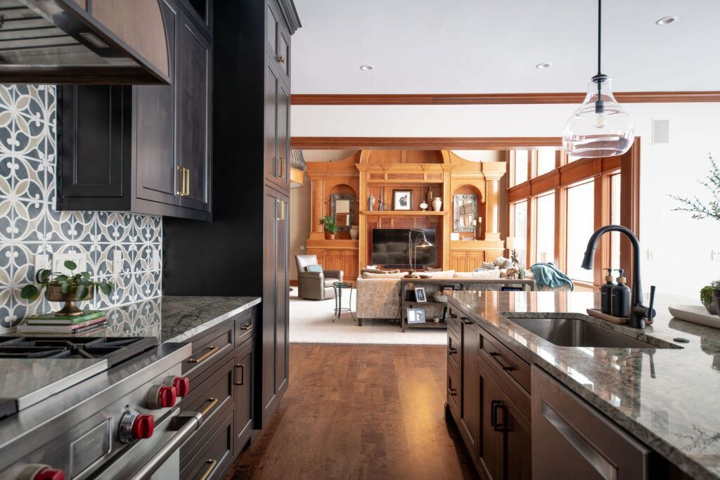
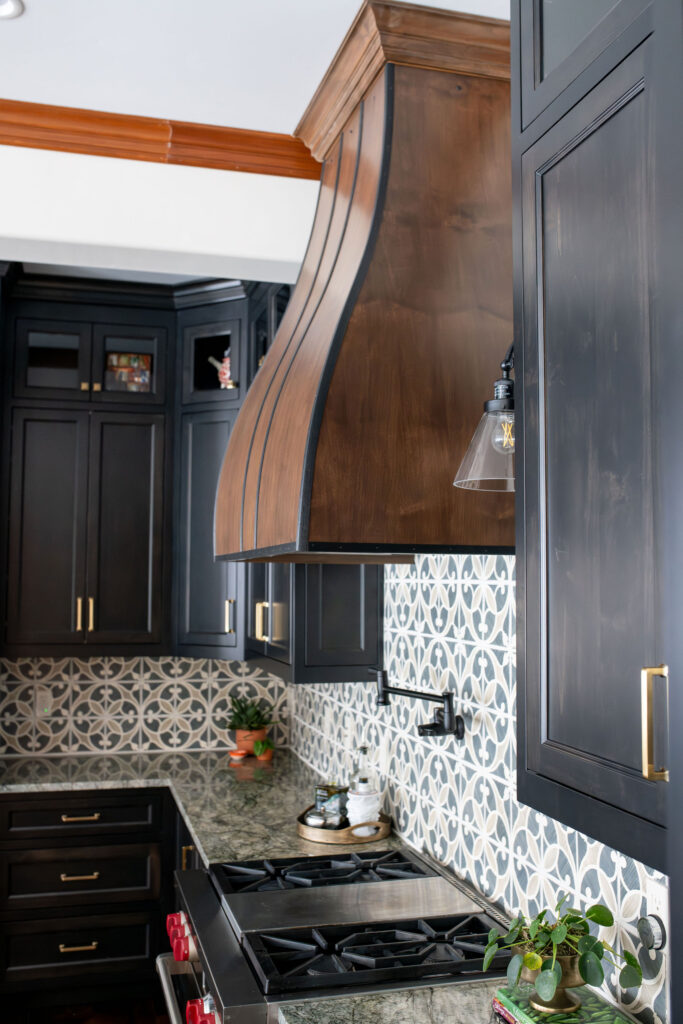
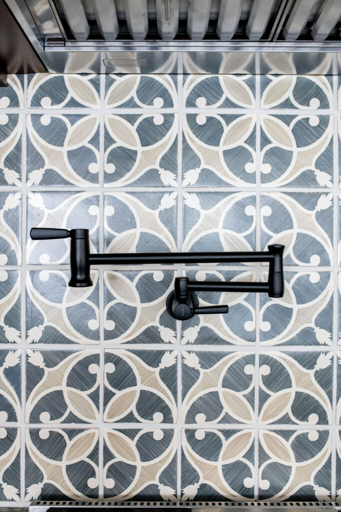
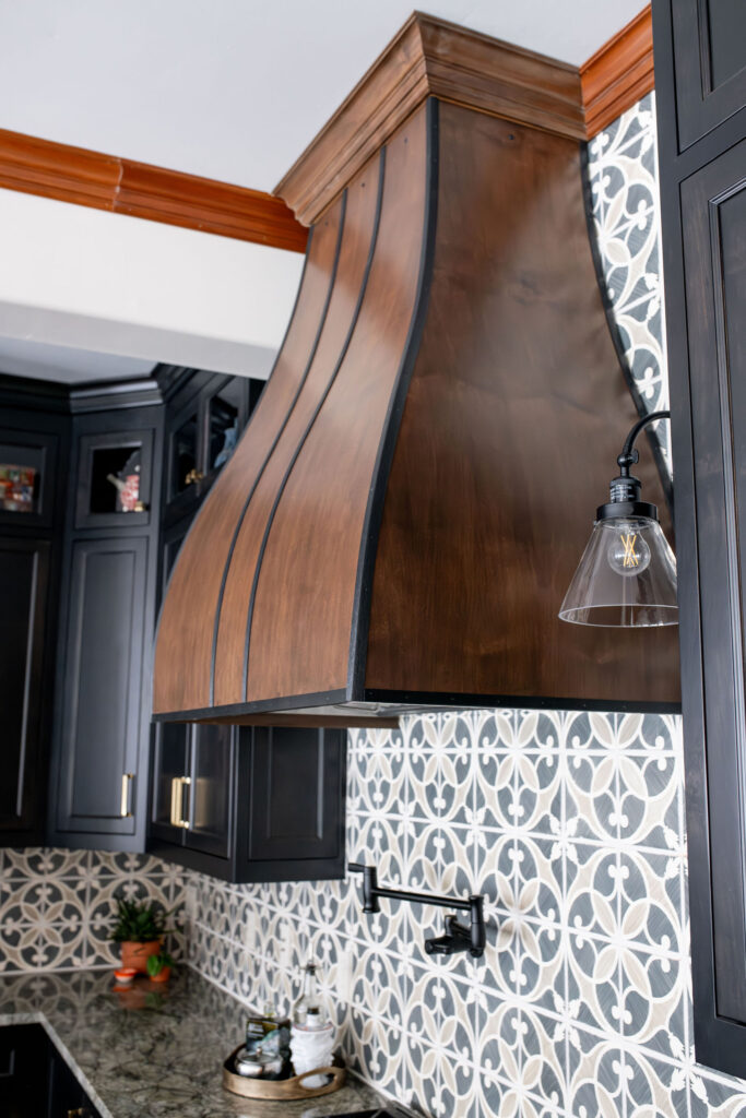
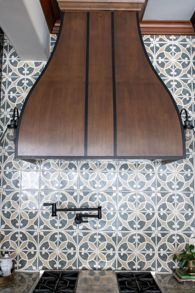
The backsplash is a showstopper – a handmade Italian tile that adds just the right amount of personality without overwhelming the space.
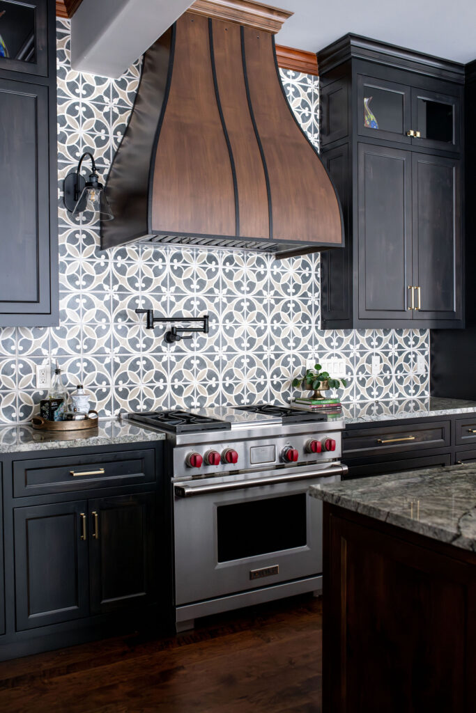
The hood is another great feature in the space. While it looks like it’s metal, it’s actually a wood hood with a little bit of metal trimming. The master carpenter was able to mimic a metal look at a fraction of the cost, which helped even out the budget, since the handmade Italian tile was over the original allowance.
And let’s talk about those pendant lights! The glass shades keep things airy while adding an elegant, modern touch.
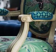
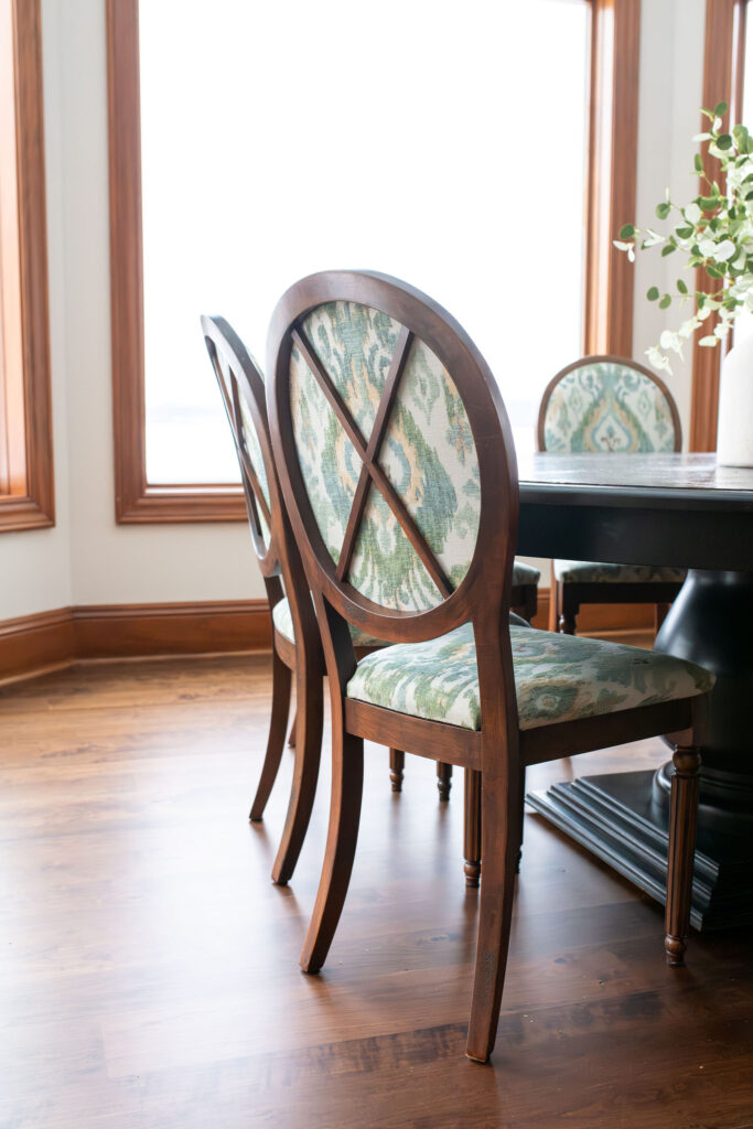
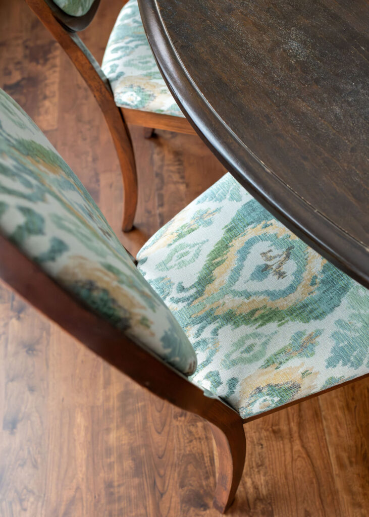
The dining area is now an inviting space with a more modern chandelier and reupholstered chairs that tie the whole look together.
This kitchen went froma bit outdated to bold and timeless. The mix of dark cabinetry, warm wood, and sophisticated details creates a space that feels modern yet inviting – exactly what we envisioned. Now, it’s not just a kitchen; it’s a gathering place, a statement, and a perfect blend of function and style.
Need help with your kitchen design? Email us at info@lindseyputzier.com or set up a Discovery Call.