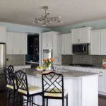
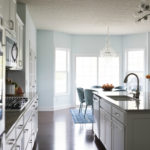
This kitchen went from dark and boring to light and fabulous!
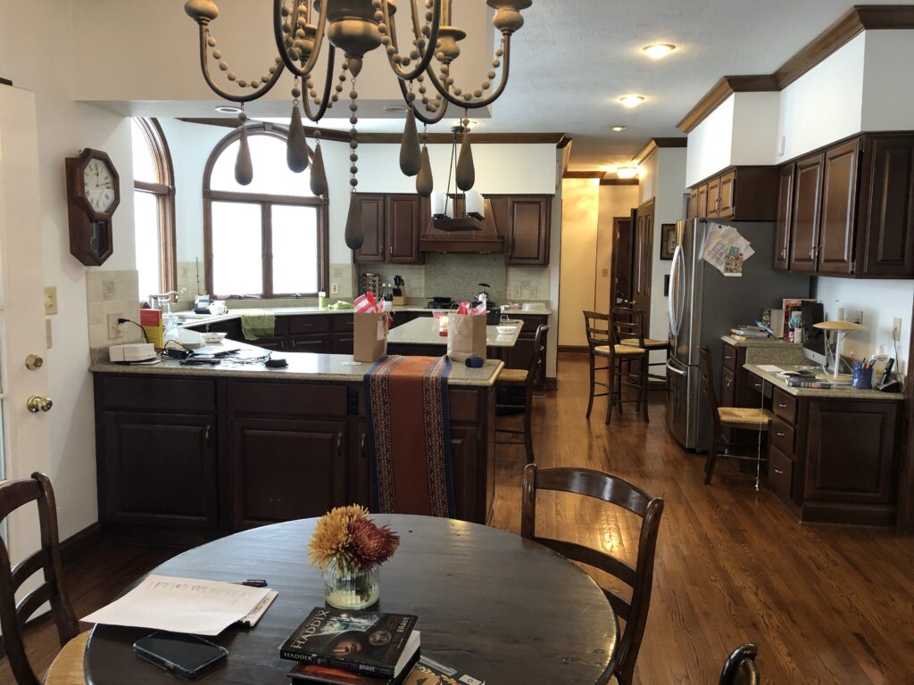
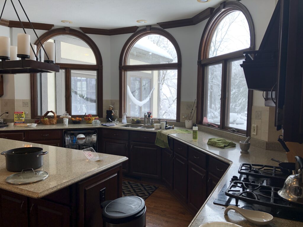
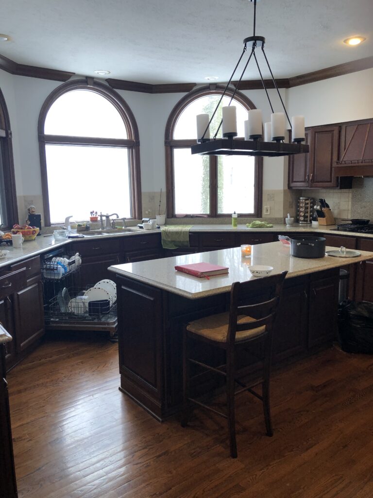
The “before” features the “peninsula in a bay window” design that was oh-so-popular back in the 90’s and early 2000’s. The kitchen also featured incredibly thick soffits that did nothing but highlight just how squatty the original upper cabinets were. Why oh why did the builder use such teensie upper cabinets? We may never know…but it’s a prolific epidemic here in Hudson, OH.
Let’s look closer at this island/peninsula combo thing.
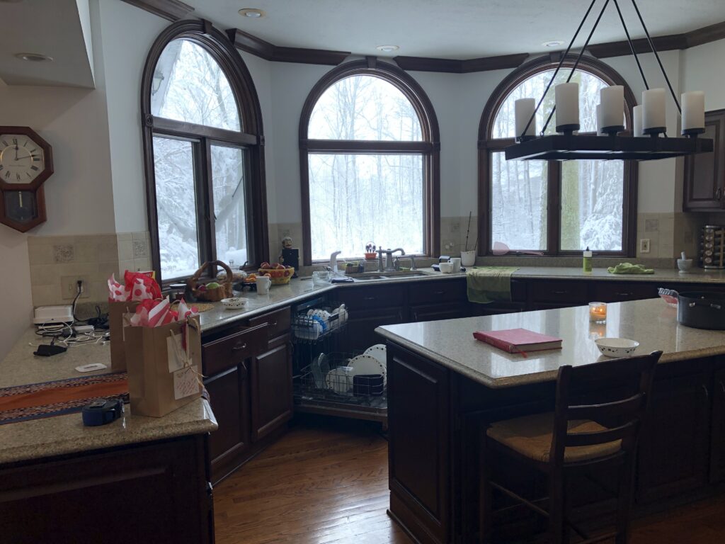
It’s not great. The island is only large enough for three stools, and it’s tight to walk behind the stools if you want to get anything out from the fridge.
The peninsula cuts off the kitchen. If you look closely as the top left corner, you can see the lovely soffit wraps around the peninsula too. Most homes actually have another set of upper cabinets under the soffit. My guess was the previous homeowners ” updated” the kitchen and got rid of those uppers…but they left the soffit. So. Weird.
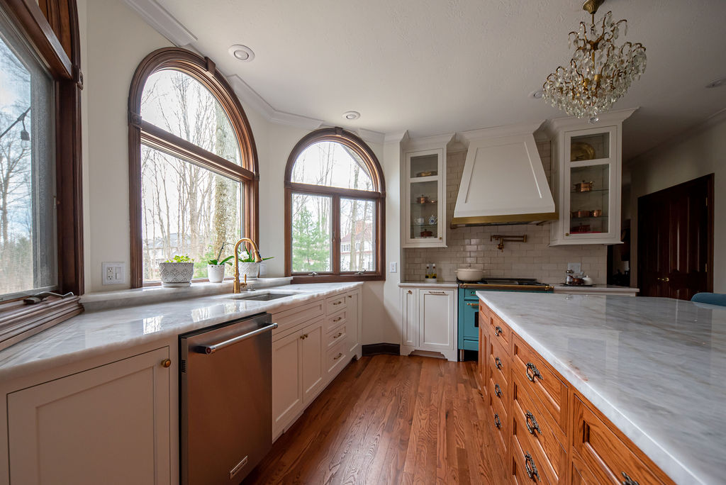
We straightened out the cabinetry along the bay window wall, which left us enough space to add a large, functional island that now seats 4 people.
Another odd thing in this kitchen is the backsplash. I do not recommend shoving tiny bits of 18″ high backsplash in between large windows.
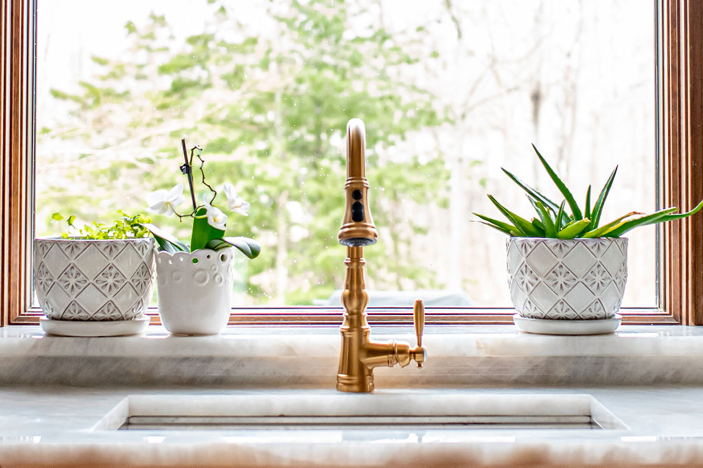
Instead, we added a plant ledge to the area behind the sink. This space gets plenty of light!
We also eliminated some of the backsplash in between the windows and stove wall. It’s not necessary and just looked odd.
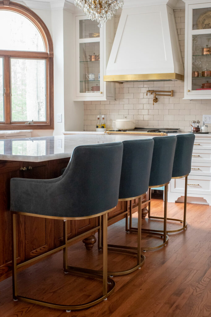
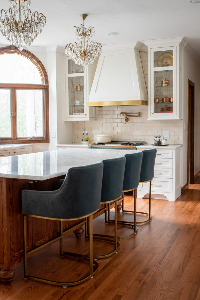
Can we take a moment to admire the new lighting?
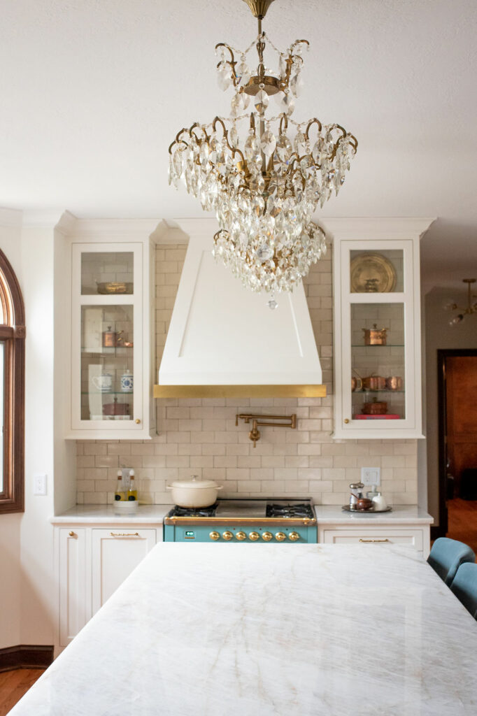
These are antique European chandeliers. Don’t they look so elegant in this space? I adore these.
Let’s move on to the counters. These are REAL quartz counters. What does that mean?
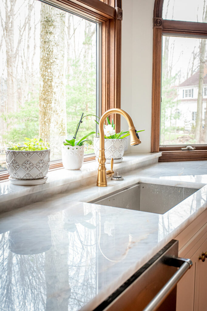
This is actual stone – not to be confused with manmade quartz that’s a mix of stone dust and resin. These natural quartz counters are absolutely stunning. There’s a depth to these counters that you just cannot achieve with manmade quartz.
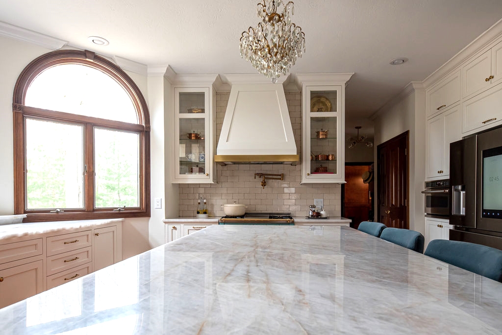
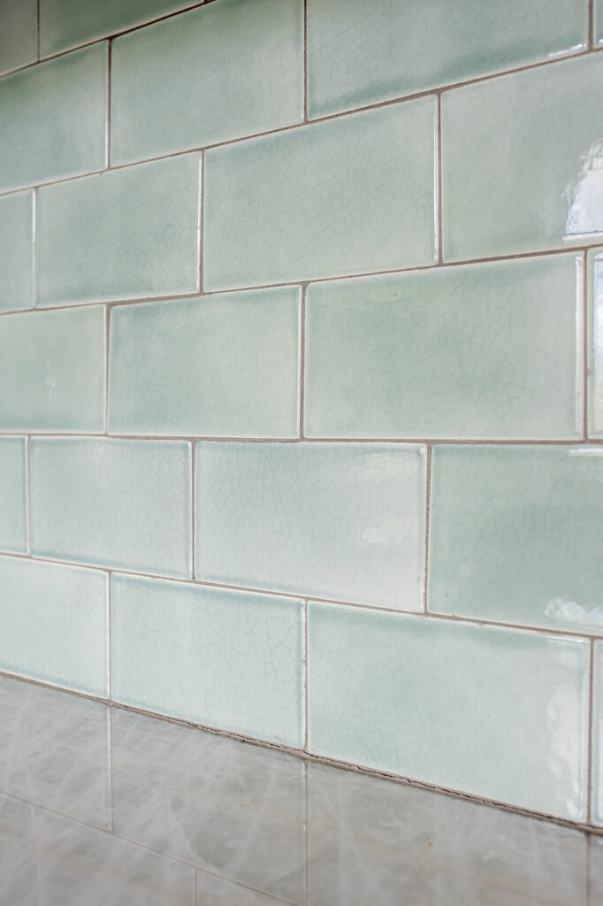
Next, let’s talk backsplash tile. There are two different backsplash tiles in this space:
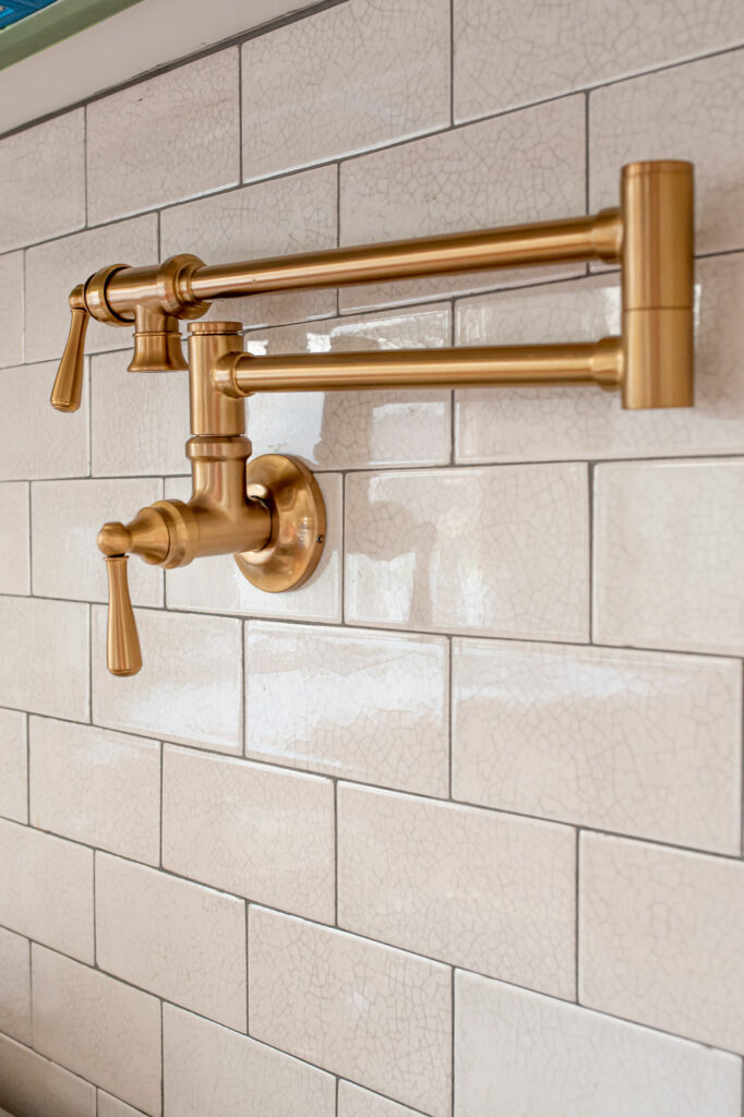
We kept the tile behind the stove neutral so that the stove itself can be the star!
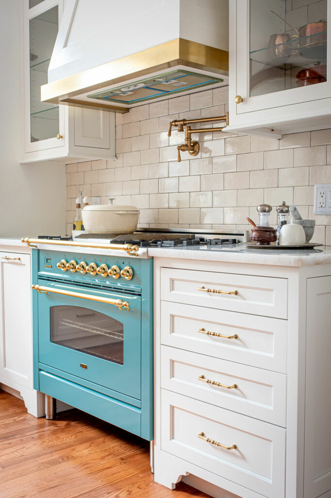
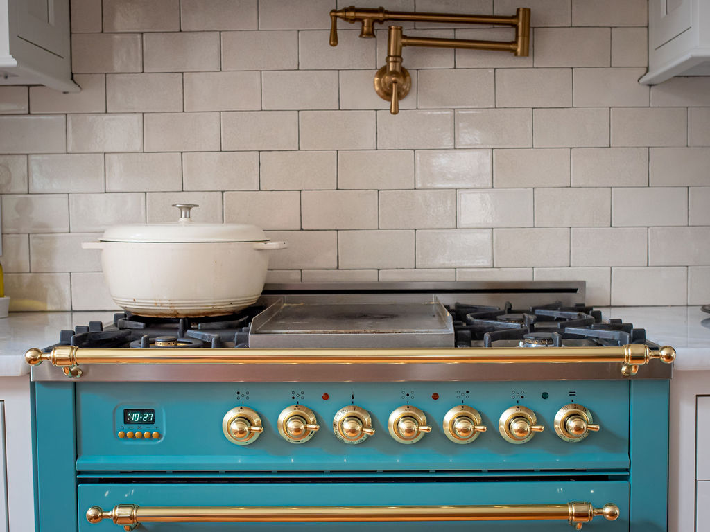
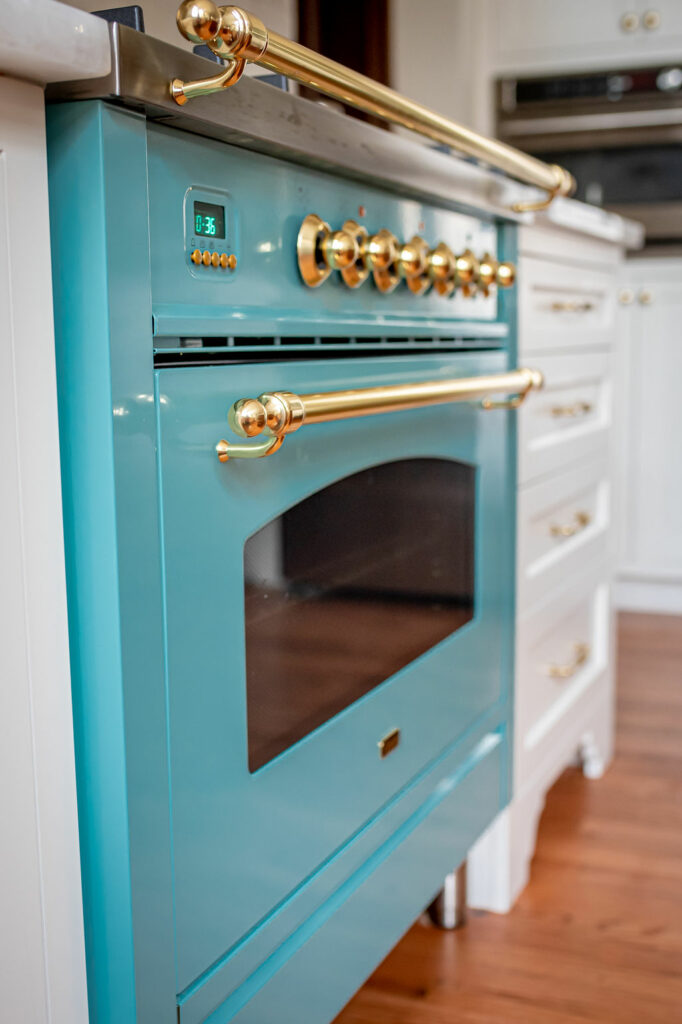
Isn’t she a beaut? This European stove was custom made for my client.
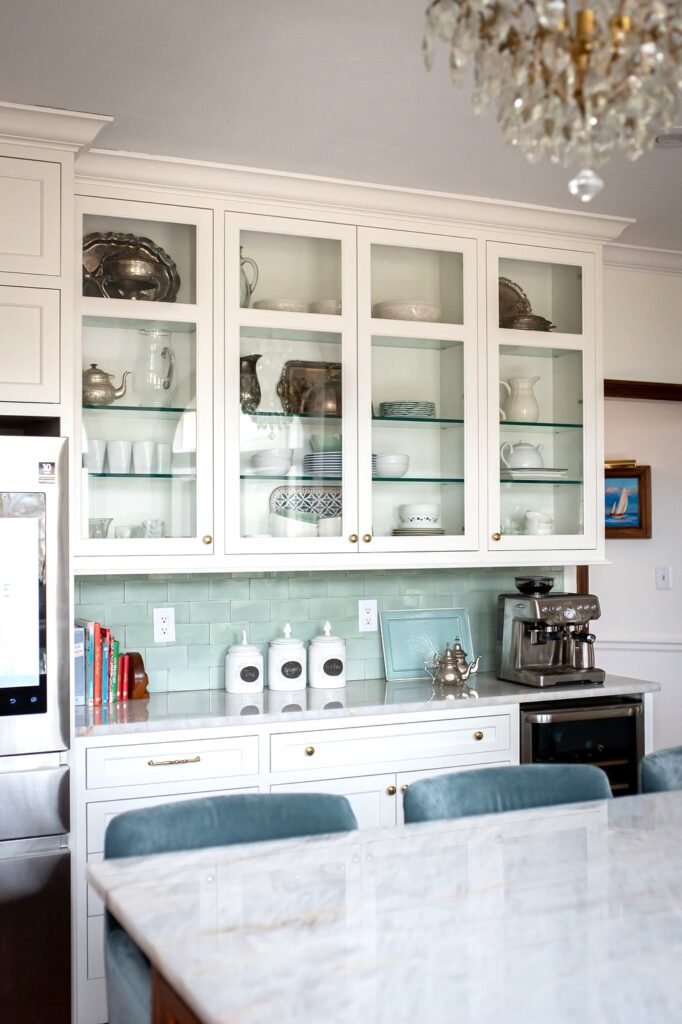
We then used a dusty teal colored tile on the adjacent wall to mimic the stove, without being over the top.
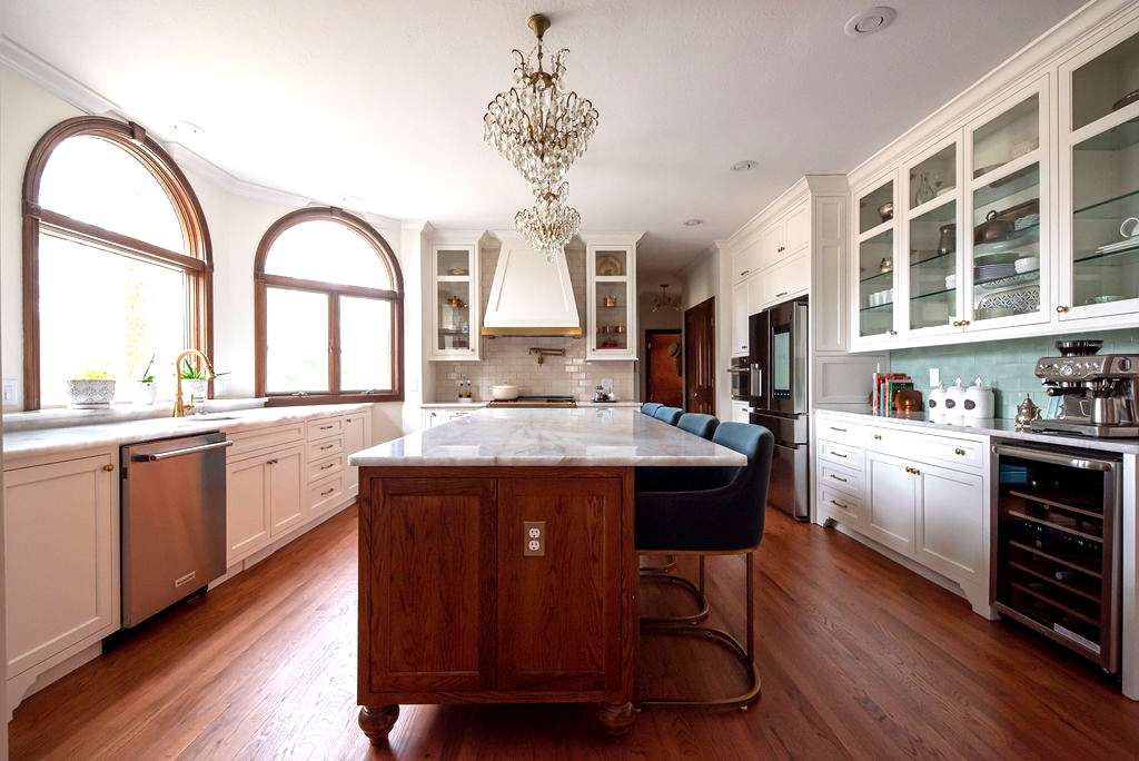
Here’s a view of the whole room, so you can see how the two areas connect. And did you notice something else? The island cabinetry is different than the perimeter cabinetry.
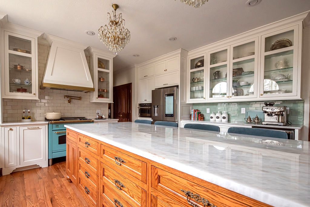
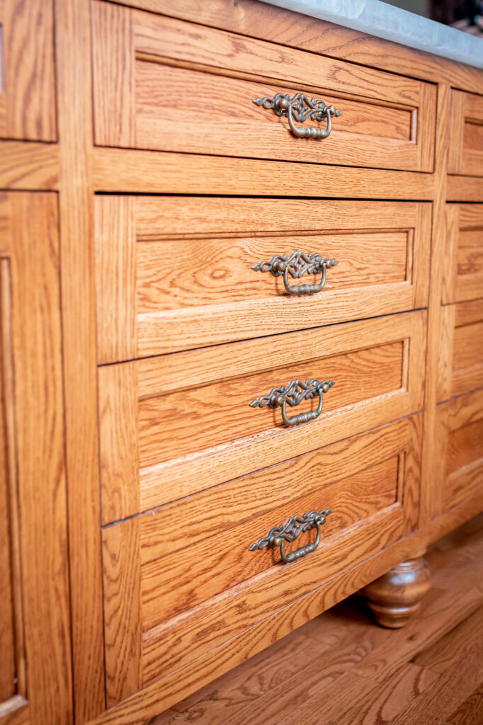
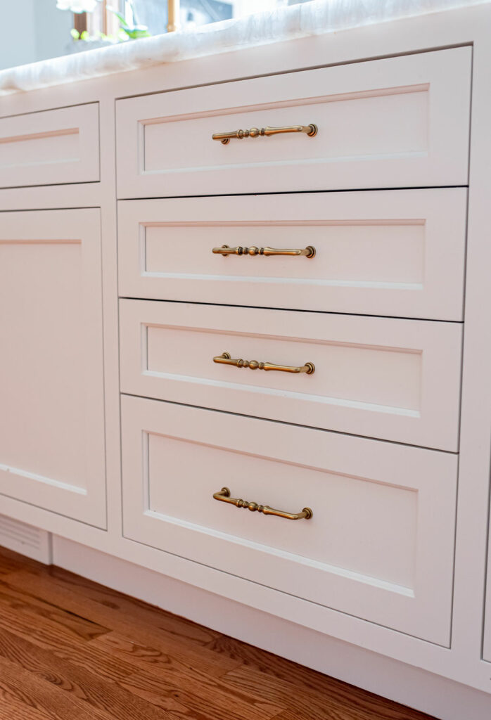
Yes, that is on purpose. We wanted the center island to mimic a piece of furniture, so we designed the legs and pulls to be different than the other cabinetry. It’s also stained oak, as opposed to painted maple.
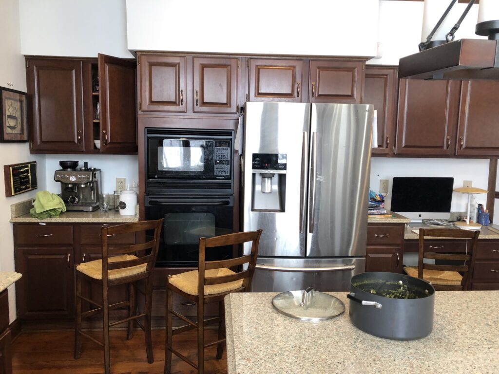
This long wall got quite the makeover. Man, this “before” is just not ideal. Such wasted space with those soffits. And that kitchen desk that no one has used since 1997…
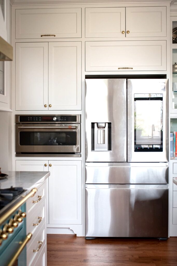
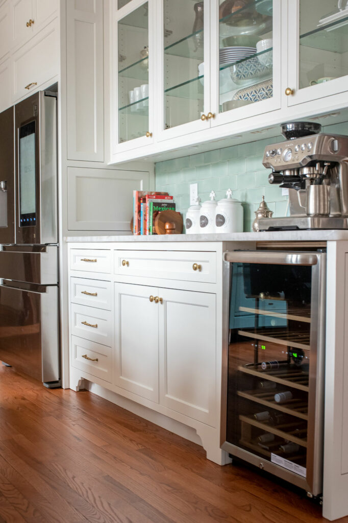
Here’s the “after.” No more soffits! Counter space that makes sense for the 21st century! And a new wine fridge. Because wine rocks.
We hope you’ve enjoyed learning more about this beautiful kitchen renovation. Book a Discovery Call with us to discuss how we can transform your kitchen!


