This Hudson kitchen went from boring to beautiful with a new transitional design that features stunning tiles and a great new layout!
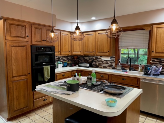
Let me be real – this kitchen needed some work. The original was from the 1980’s but looked even older – and not in a “oh what a classic design” kind of way. More in a “yeah this is really outdated and never was cute” kind of way.
See what I mean?
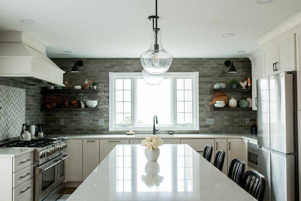
This was a major overhaul. The sink stayed in its original spot, but all of the other appliances were moved around. The window was also enlarged to take advantage of the sunlight.
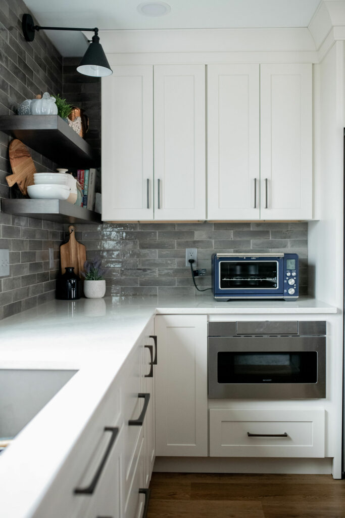
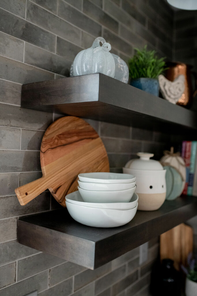
Instead of crowding the space with a ton of upper cabinets, we kept the sink/window wall clean and open with just a few decorative shelves. To ensure adequate lighting, we added some directional sconces that are as pretty as they are functional!
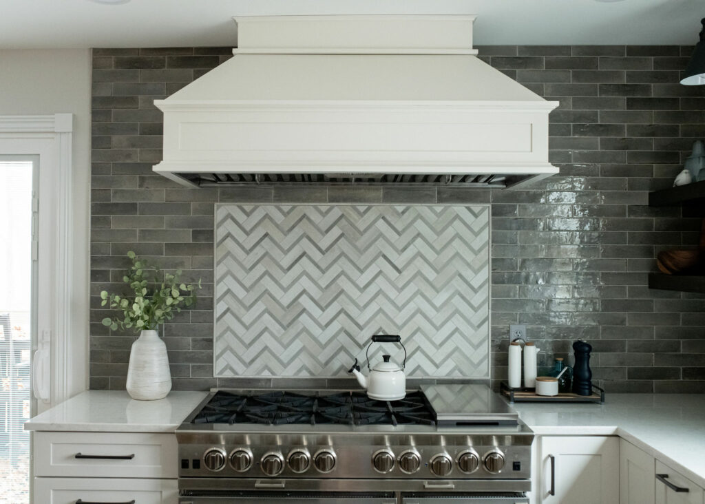
Let’s take a look at this range. Isn’t she a beaut? We added a beautiful marble herringbone accent tile to break up all the gray.
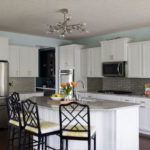
To ensure the kitchen stayed as bright as possible, we added white cabinets along the perimeter. The white contrasts nicely with the gray tile, which has lots of different grays for added dimension and texure. This tile is MUCH more interesting than plain subway tile, yet is still neutral.
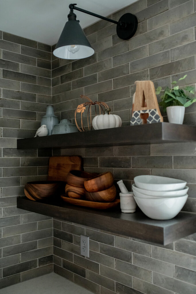
To keep the kitchen from being too overly white and gray, we added a dark wood island and dark shelves. Gray is great, but add too much of it and you’ll end up with a dated home. Yes, all-gray-everywhere was very 2015. We’re seeing less and less of it in home decor, so it’s essential that we balance the gray with other neutrals.
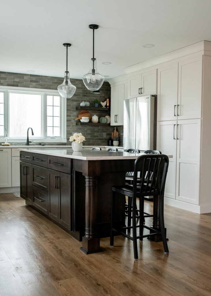
See how the addition of some warm browns really helps balance the space? The lighter wood floors also bring more warm neutrals to the room.
The Details
Let’s chat details for a minute. The large-scale spacial design of a kitchen is essential for its overall function. If spaces are too narrow or appliances are too far apart, then the kitchen as a whole won’t function well for your family. However, once we have the space planning in place, it’s time to select all the tiny details!
This is the phase where decision fatigue hits for a lot of clients. Think about it – you’ve already selected your appliances, the length of your island, where your fridge is going to go, what style of cabinets you want, not to mention the flooring, counters, backsplash, paint colors, etc.
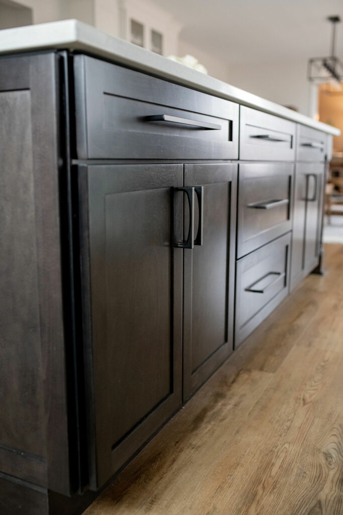
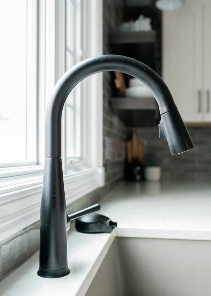
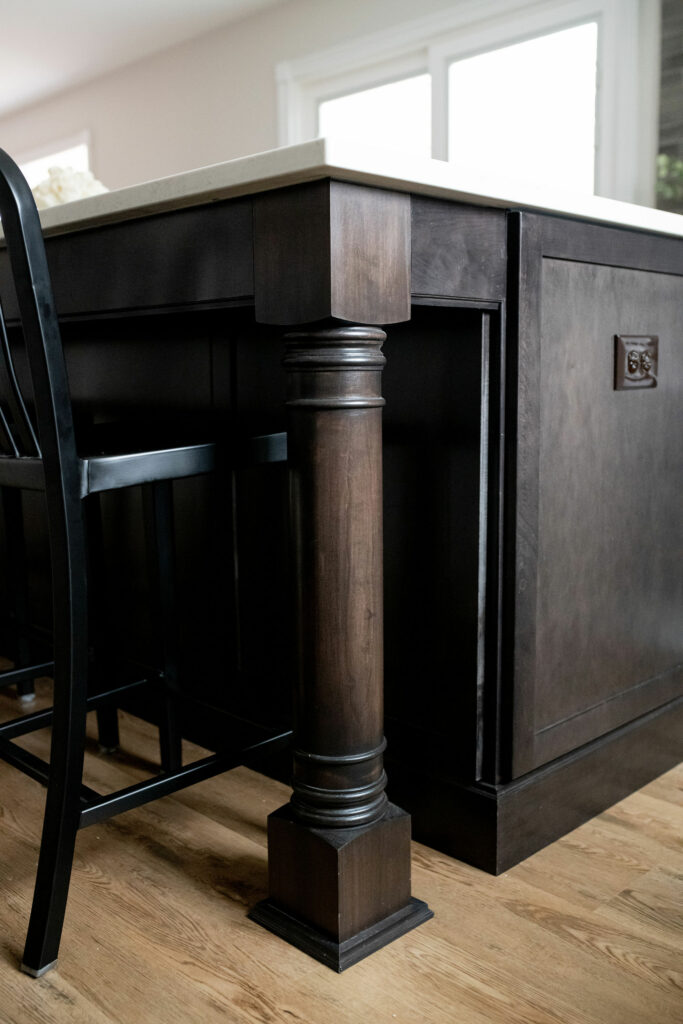
And now it’s onto the tiny details. Cabinetry pulls, sizes, and colors. Faucet style and color. Island leg style. Grout colors. Flooring and backsplash layout (brick pattern? straight? 1/3 offset? herringbone?) This is when working with a professional still is so helpful. You may be overwhelmed. For us, this is just a regular Tuesday. We will go through the details with you and ensure you don’t make a “whatever – I’m totally over this!!” decision or twelve. It happens – we see it all the time.
The Dining Space
Ok, getting off my pedistal, here’s the “before” of the back half of the kitchen:
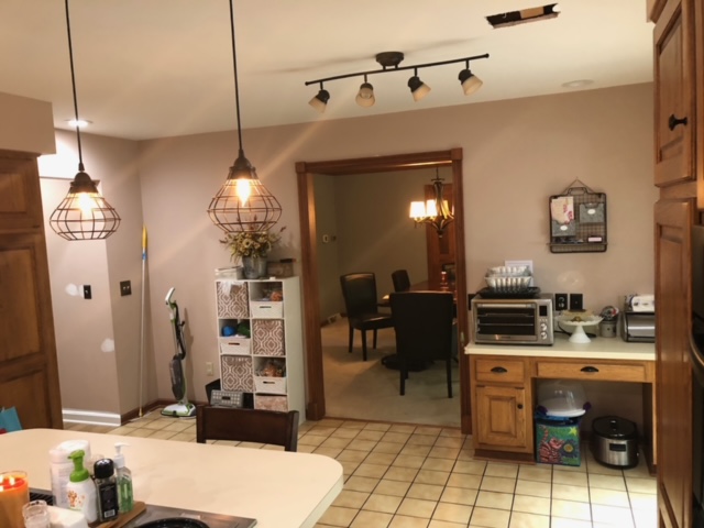
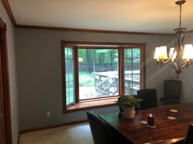
The kitchen was MUCH smaller. Here’s the dining room, which was beyond the kitchen originally. Note the placement of the bay window!
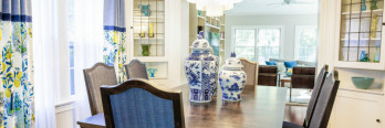
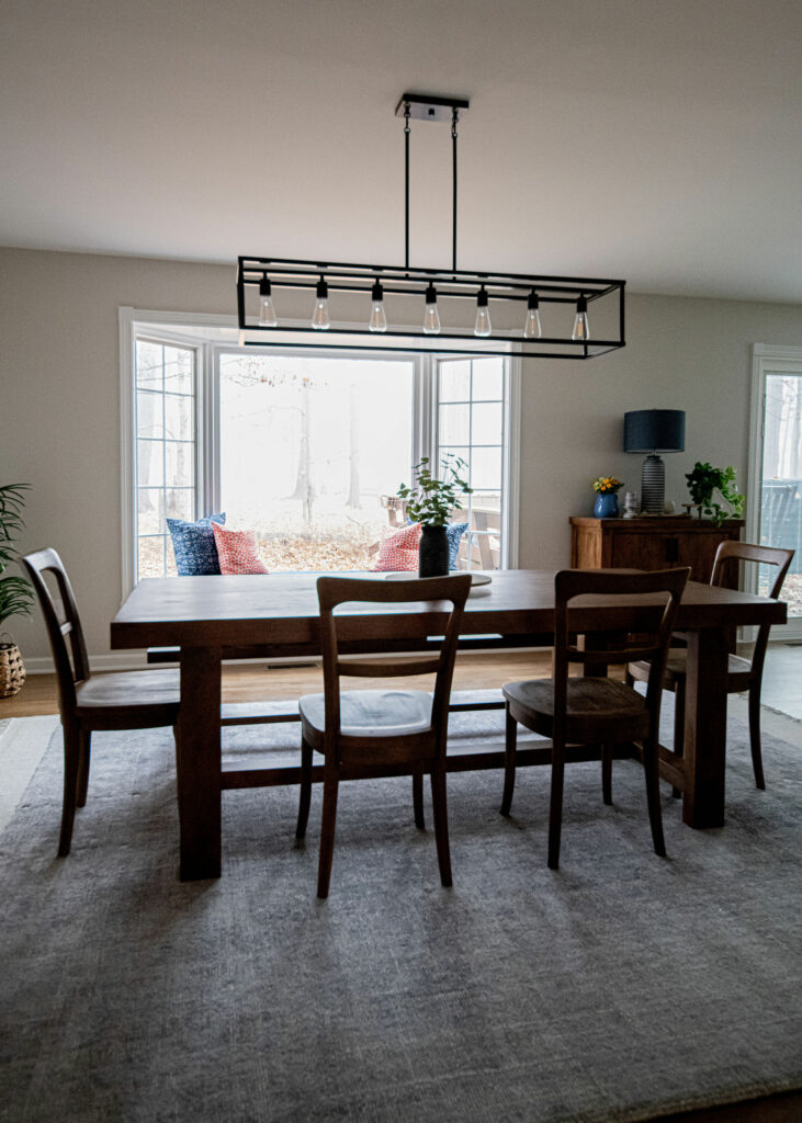
That wall goes bye bye, and we’re left with a really functional, open dining area! See where the windowseat is now? It’s integrated into the actual kitchen.
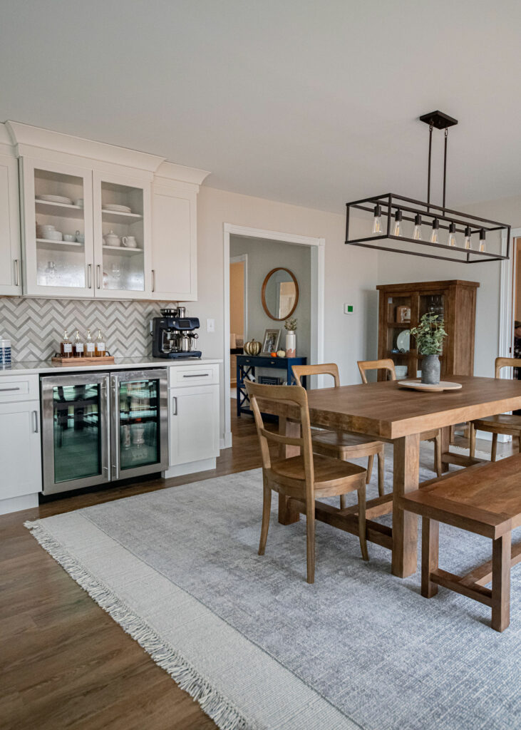
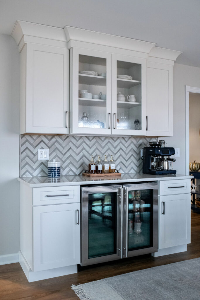
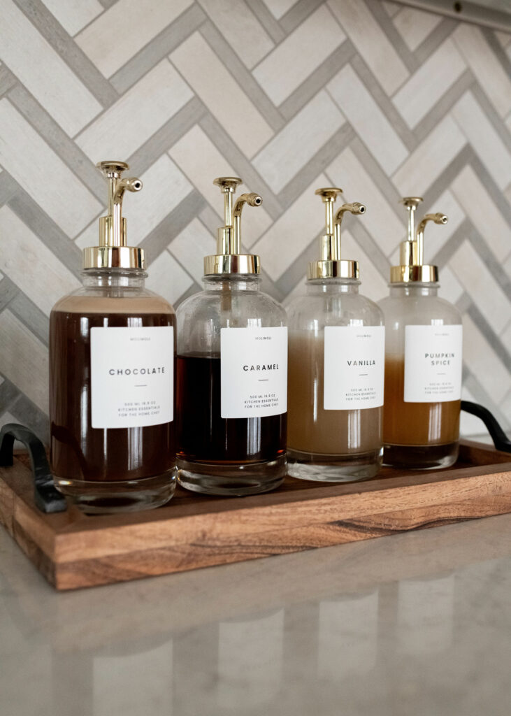
The removal of the wall also let us add a large coffee/wine bar where there was once just drywall. We repeated the marble herringbone accent tile from the range over here for some continuity. Plus, it’s so pretty!!
Let’s chat for a minute about the crown molding above the cabinets. This style is called “cove,” and it’s one of my favorite crown molding styles. It’s a great choice for more casual traditional homes, essentially any transitional home, and even fancier contemporary homes.
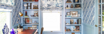
Here are some more details:
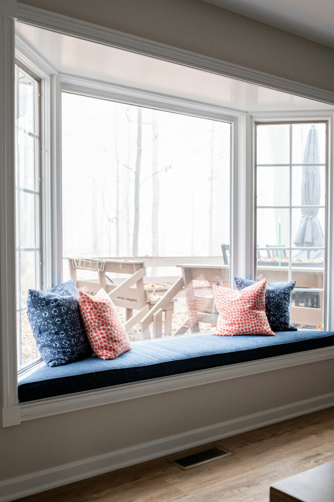
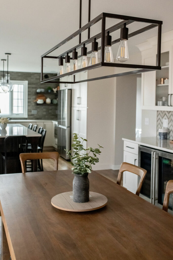
My upholsterer made this custom windowseat cushion for this client. It’s made from a performance fabric that beads up liquid and is easily cleanable with dish soap and water.
The light fixture is purposefully streamlined and sleek. It doesn’t overwhelm the space.
Family Room
Let’s switch gears and talk about the adjacent family room for just a second. Here’s what she looked like before:
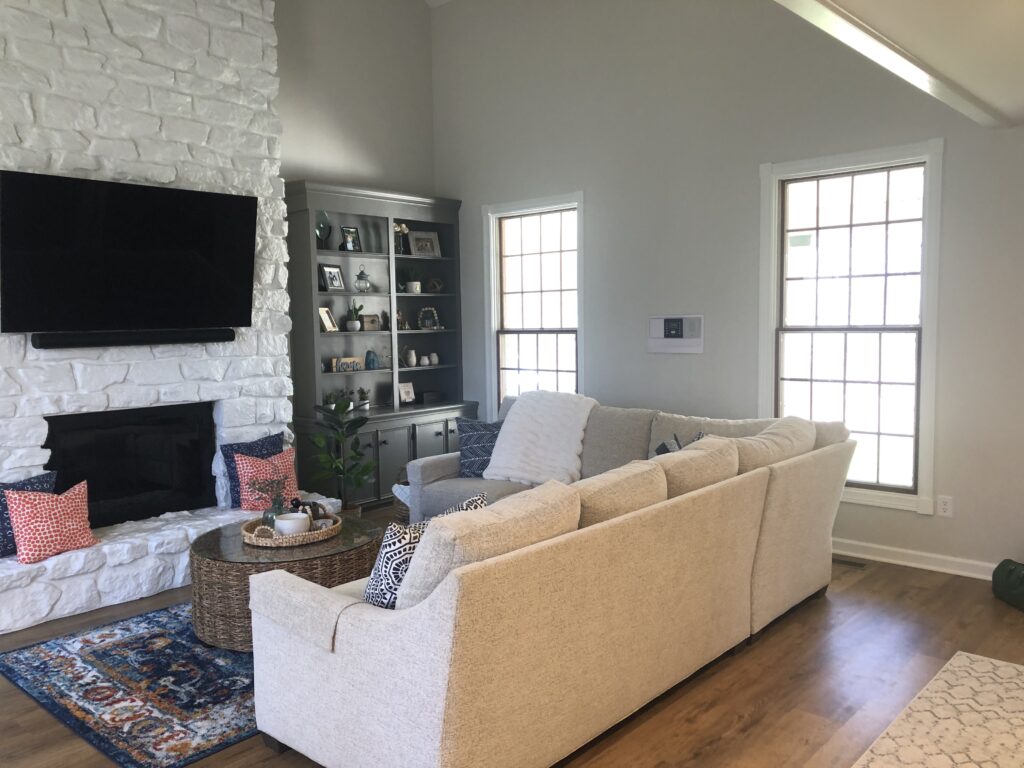
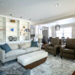
And here’s the after. It’s a subtle change, so let’s discuss.
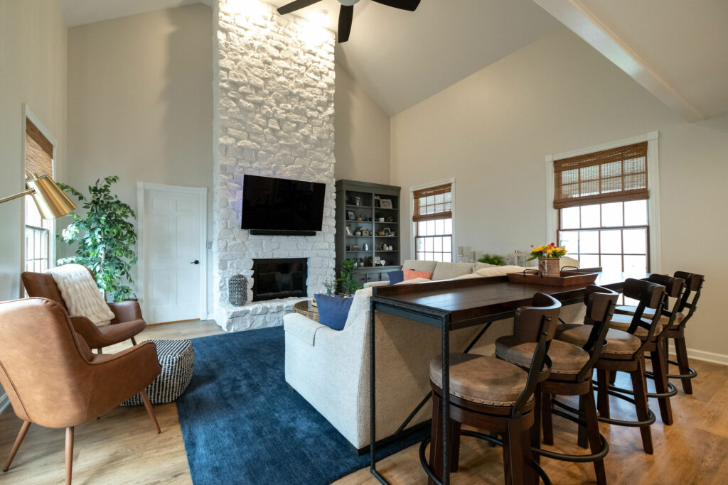
The original rug was too small, so I recommended a larger rug that fits underneath the front legs of the sectional. We also added a counter-height table and barstools for snacking while watching the TV. Lastly, we added natural shades to the windows, which are both functional and stylish.
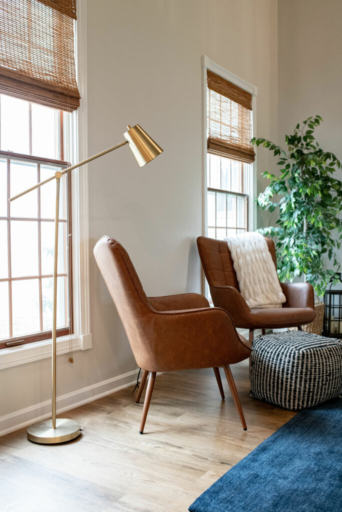
The windows look “finished” now that there’s a nice textured material on them. Plus, the texture coordinates beautifully with all of the other natural elements in the space!
Book a Discovery Call with Lindsey to chat about how we can help you achieve the kithen of your dreams!