Color does far more than make a home look beautiful. It influences mood, energy, comfort, focus, and even the way you experience a space throughout the day. In interior design, color psychology plays a powerful role in creating homes that not only look cohesive, but also feel intentional.
We approach color selection as both an artistic and emotional decision. The colors, patterns, and tones you surround yourself with can energize your mornings, create calm after long days, encourage conversation, or make a room feel deeply restorative. When thoughtfully layered together, color transforms a house into a home that supports the way you want to live.
How Color Affects Mood
Every color carries psychological associations that subtly affect the atmosphere of a room. While personal preference always matters, certain tones consistently evoke specific emotional responses.
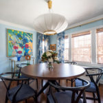
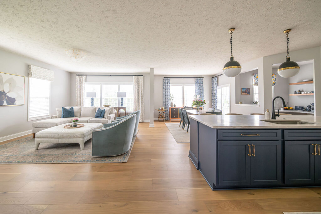
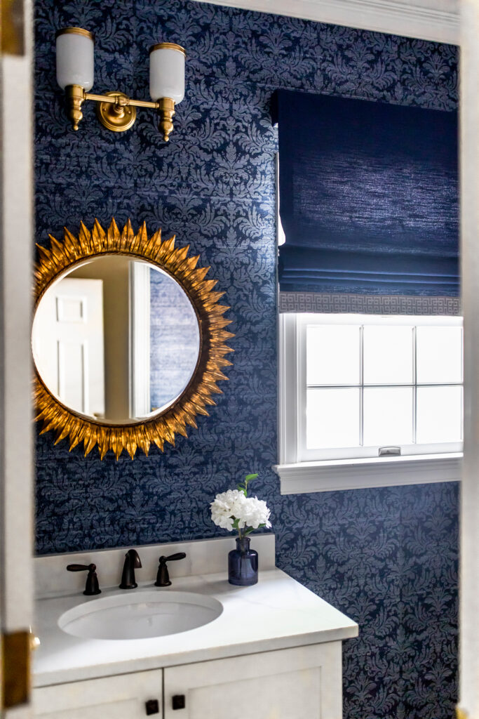
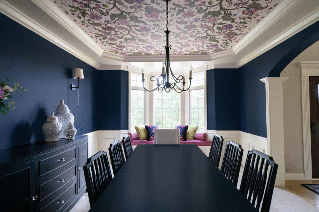
Blues: Calm & Relaxation
Blue tones create a sense of serenity and stability. Soft dusty blues and muted navy shades often work beautifully in bedrooms, bathrooms, and quiet living spaces because they encourage relaxation and mental clarity. Cooler blues can also make spaces feel crisp and refreshing.
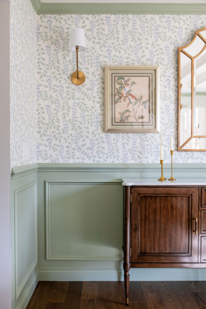
Greens: Balance & Restoration
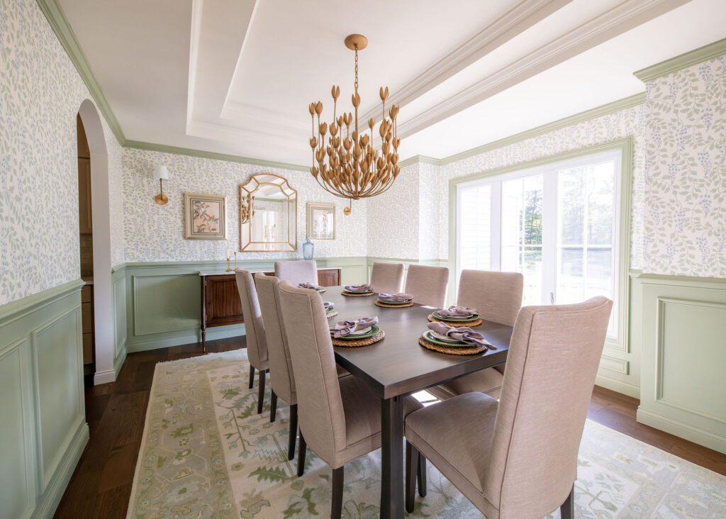
Green connects us to nature and often creates a grounding effect within the home. Sage, olive, and moss tones feel restorative and timeless, making them ideal for kitchens, offices, and living spaces where balance and comfort matter most.
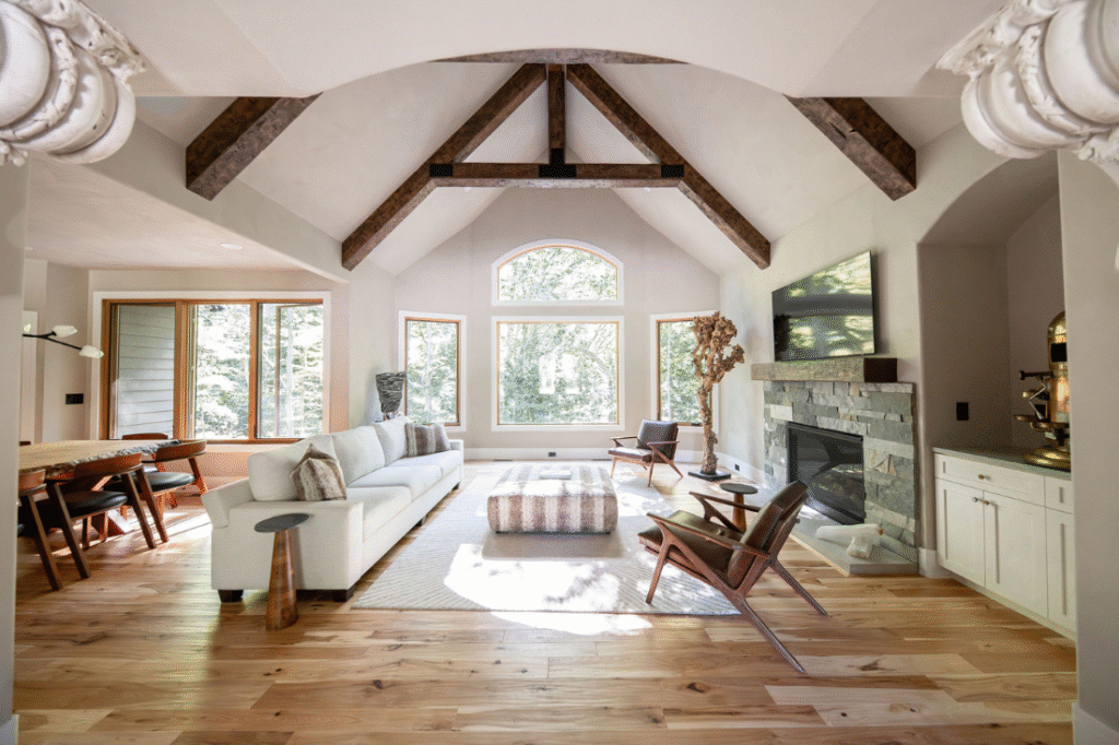
Warm Neutrals: Comfort & Sophistication
Warm whites, creamy beiges, camel tones, and taupes create inviting environments that feel approachable and layered. These shades help spaces feel comfortable without overwhelming the eye, which is why they remain foundational in timeless interior design.
Yellows & Golds: Energy & Optimism
Golden undertones and warm yellows introduce happiness, warmth, and energy. Used thoughtfully, these shades brighten kitchens, breakfast nooks, and gathering spaces. Too much bright yellow, however, can feel overstimulating, so balance becomes key.
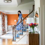
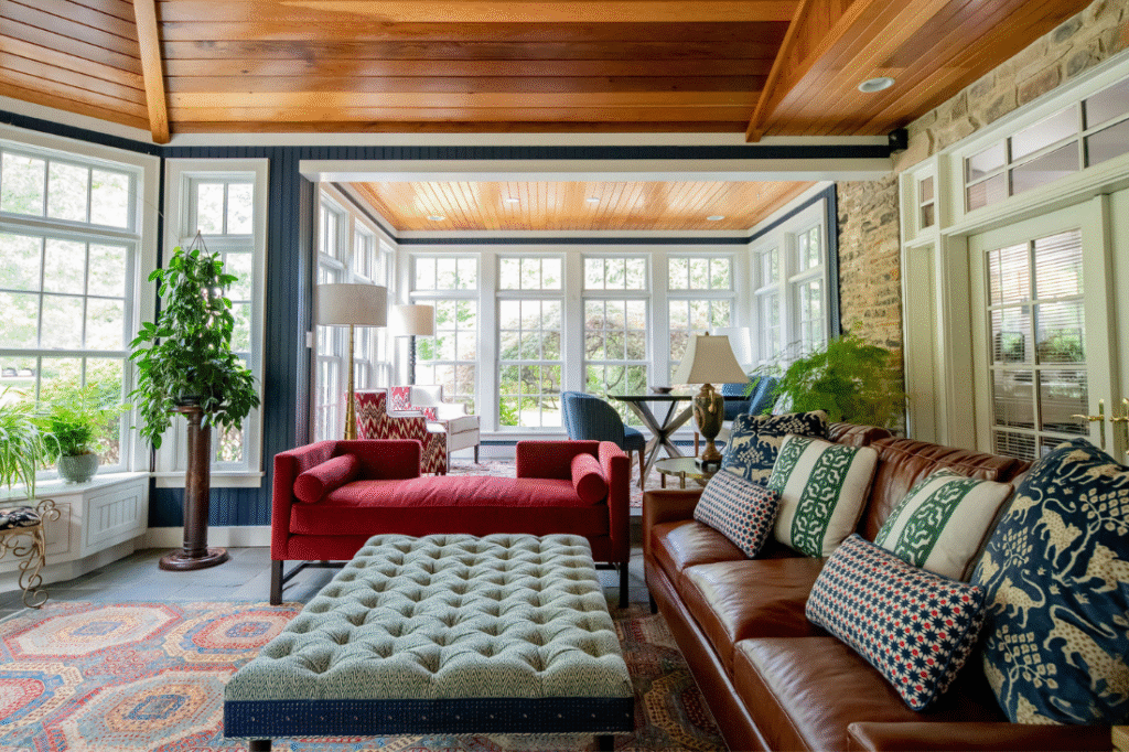
Reds & Terracottas: Passion & Warmth
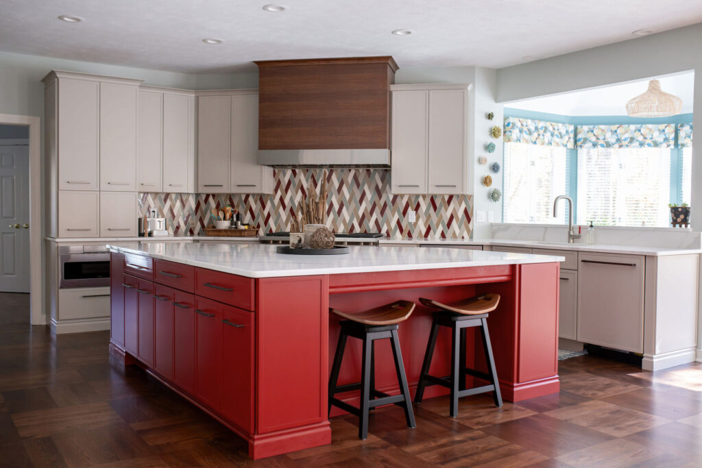
Rich reds, rust tones, and earthy terracottas add intimacy and depth. These colors naturally encourage conversation and warmth, making them especially effective in dining rooms, lounges, and entertaining spaces.
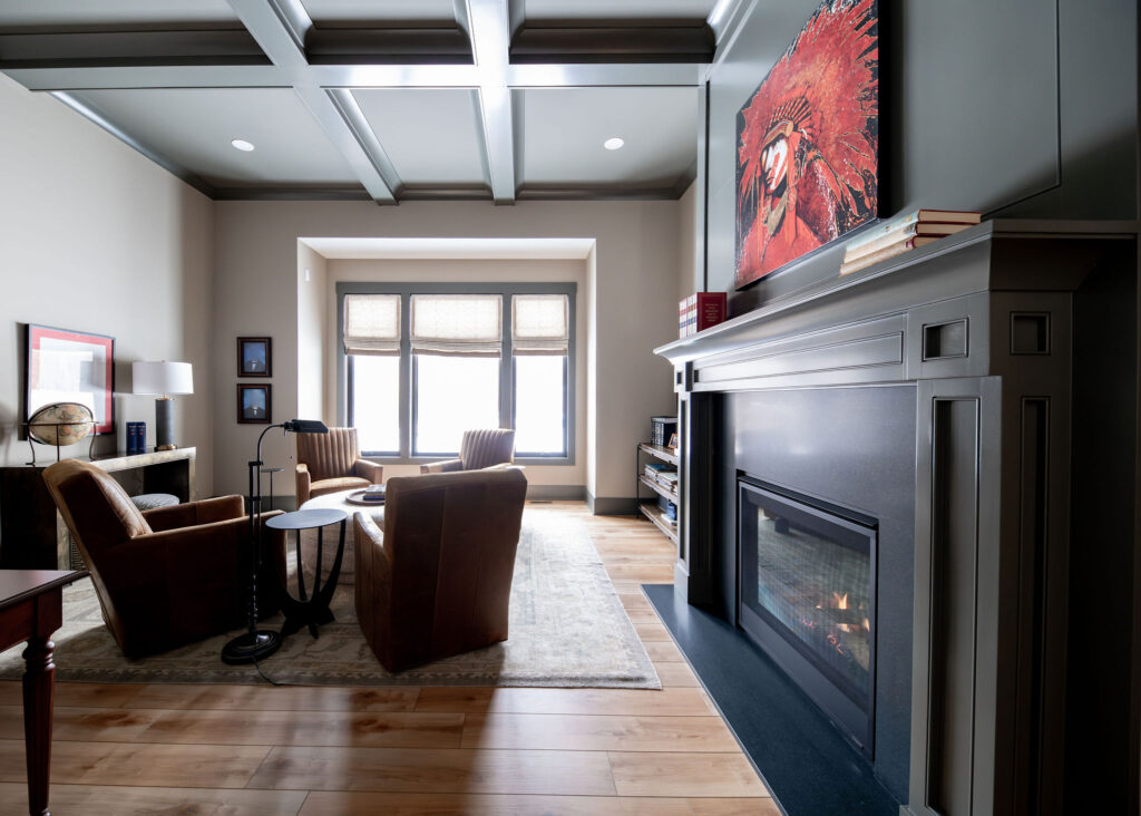
Dark Colors: Drama & Security
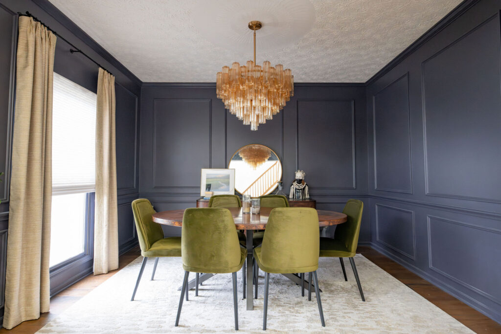
Charcoal, deep green, chocolate brown, and saturated navy tones create moodiness and sophistication. Darker palettes can make a room feel cocoon-like and comforting when paired with proper lighting and texture.
Choosing Wall Colors with Intention
Wall color establishes the emotional foundation of a room. Before selecting paint, we always encourage homeowners to think beyond trends and instead consider how they want the space to feel.
Ask yourself: Do you want the room to feel calm or energizing? Cozy or expansive? Sophisticated or playful? Bright and airy or moody and intimate?
The answers help guide the palette.
Consider Natural Light
Lighting dramatically changes the way color appears throughout the day. Northern light often pulls cooler, while southern exposure enhances warmth. A paint color that looks creamy and soft in one home may appear gray or yellow in another.
This is why testing samples on multiple walls and observing them morning through evening is essential before committing.
Think About Flow
Color should create movement throughout the home. That does not mean every room must match, but spaces should feel connected. Repeating undertones, complementary hues, or similar saturation levels helps the home feel cohesive rather than disconnected.
Understand Undertones
Undertones are often what make or break a paint selection. A white may lean pink, yellow, green, or gray depending on the lighting and surrounding finishes. Understanding undertones helps prevent spaces from feeling unintentionally cold, muddy, or harsh.
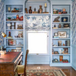
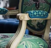
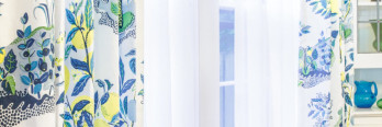
The Psychology of Patterns
Pattern influences mood just as much as color does. Wallpaper, textiles, tile, and layered prints all contribute to the emotional energy of a room.
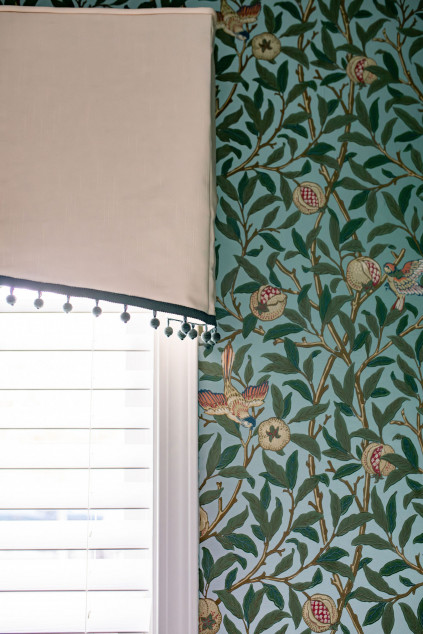
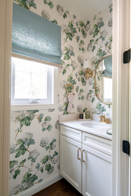
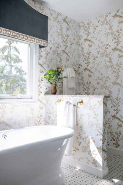
Organic Patterns Feel Relaxing
Botanical prints, soft florals, and nature-inspired textures tend to create calming environments because they subconsciously connect us to the outdoors.
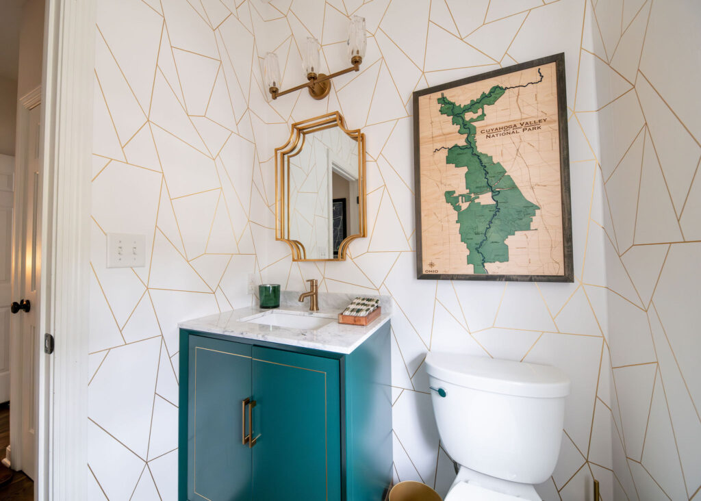
Geometric Patterns Feel Structured
Clean lines and geometric designs create order and rhythm. These patterns often feel energizing and modern, making them excellent for offices, powder rooms, or contemporary spaces.
Large-Scale Patterns Create Drama
Oversized wallpaper murals or bold prints make a statement and create visual excitement. Used strategically, they can completely transform the personality of a room.
Layered Patterns Add Depth
Mixing patterns thoughtfully creates richness and personality within a home. The key is balancing scale, color, and texture so the room feels curated rather than chaotic.
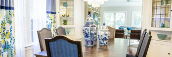
Selecting Colors for Different Spaces
Different rooms serve different emotional purposes, so their palettes should support the way they function.
Bedrooms
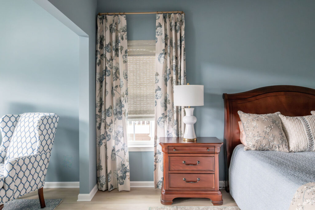
Bedrooms benefit from calming palettes that encourage rest. Soft blues, greens, warm neutrals, and muted earthy tones create peaceful retreats.
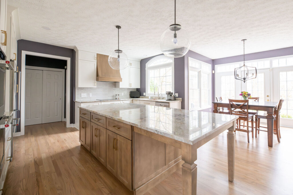
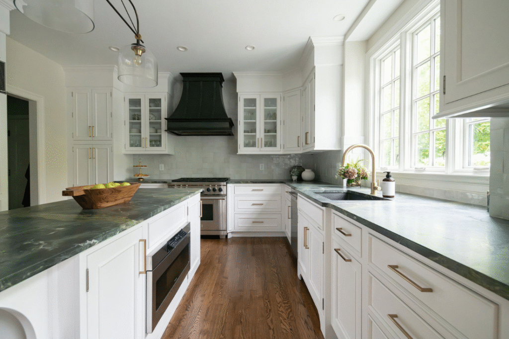
Kitchens
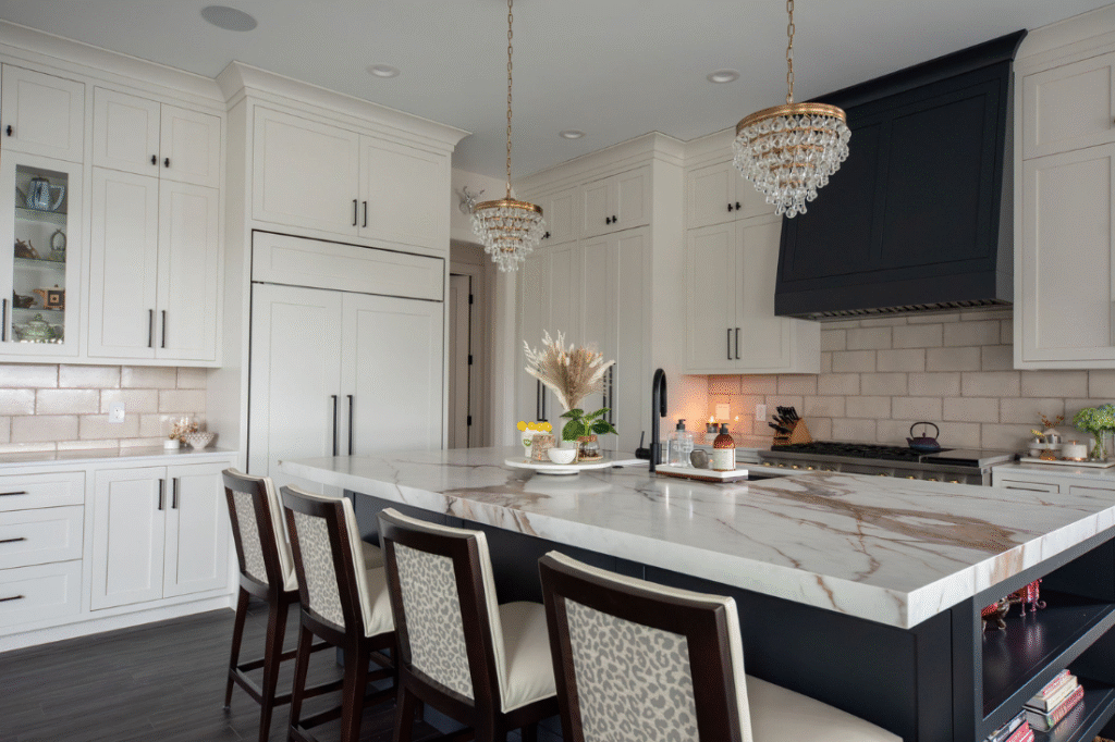
Kitchens often work best with welcoming, energetic colors. Warm whites, earthy greens, soft blues, and layered wood tones help kitchens feel lively yet grounded.
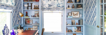
Home Offices
A productive workspace benefits from colors that improve focus without feeling sterile. Green often works beautifully because it balances calmness and concentration.
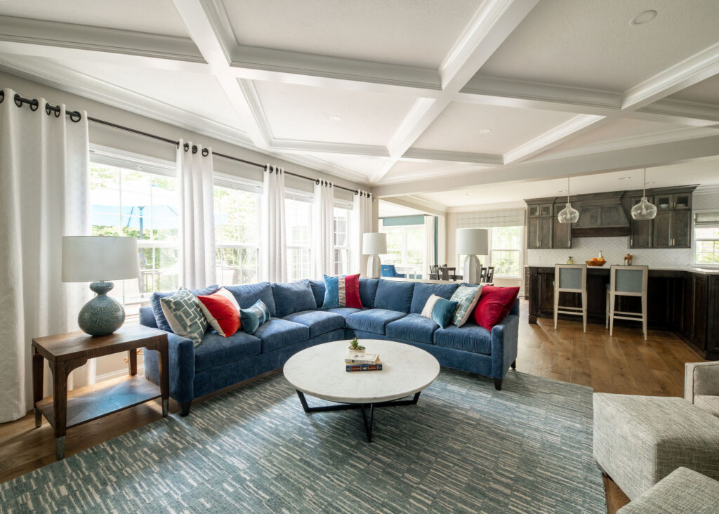
Living Rooms
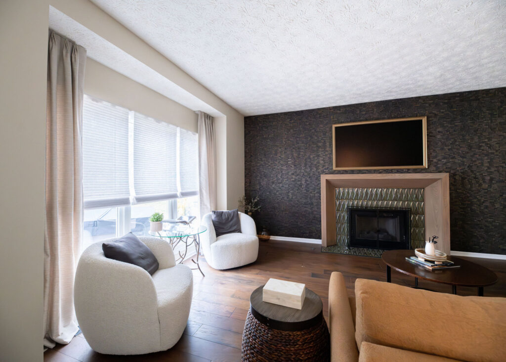
Living spaces should reflect the atmosphere you want guests and family to experience. Warm neutrals feel inviting, while deeper saturated tones create intimacy and drama.
Powder Rooms
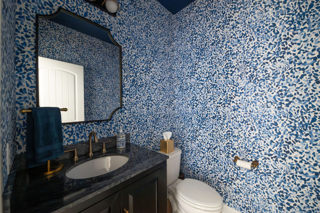
Powder rooms provide an opportunity to take design risks. Bold wallpaper, darker paint colors, and dramatic patterns create memorable experiences in smaller spaces.
Why Color Selection Is More Complex Than It Seems
Many homeowners choose paint colors first and design around them later. In reality, successful color selection considers every element in the room.
A color that looks beautiful in isolation may completely change when paired with surrounding finishes. That is why professional designers view color holistically rather than as a standalone decision.
Designing a Home That Feels Good
The best interiors do more than photograph beautifully. They support your routines, reflect your personality, and create emotional comfort in everyday life.
Color psychology allows us to design intentionally. Whether we are layering warm neutrals for a calming retreat, introducing rich tones for drama, or selecting playful patterns that spark joy, every design choice contributes to how a home feels.
Your home should not only look beautiful; it should emotionally support the people living inside it.
Looking for some intention behind your next color choice? Set up a Discovery Call with Lindsey!